ILUMINAR CUSTOM RETAIL BAGS
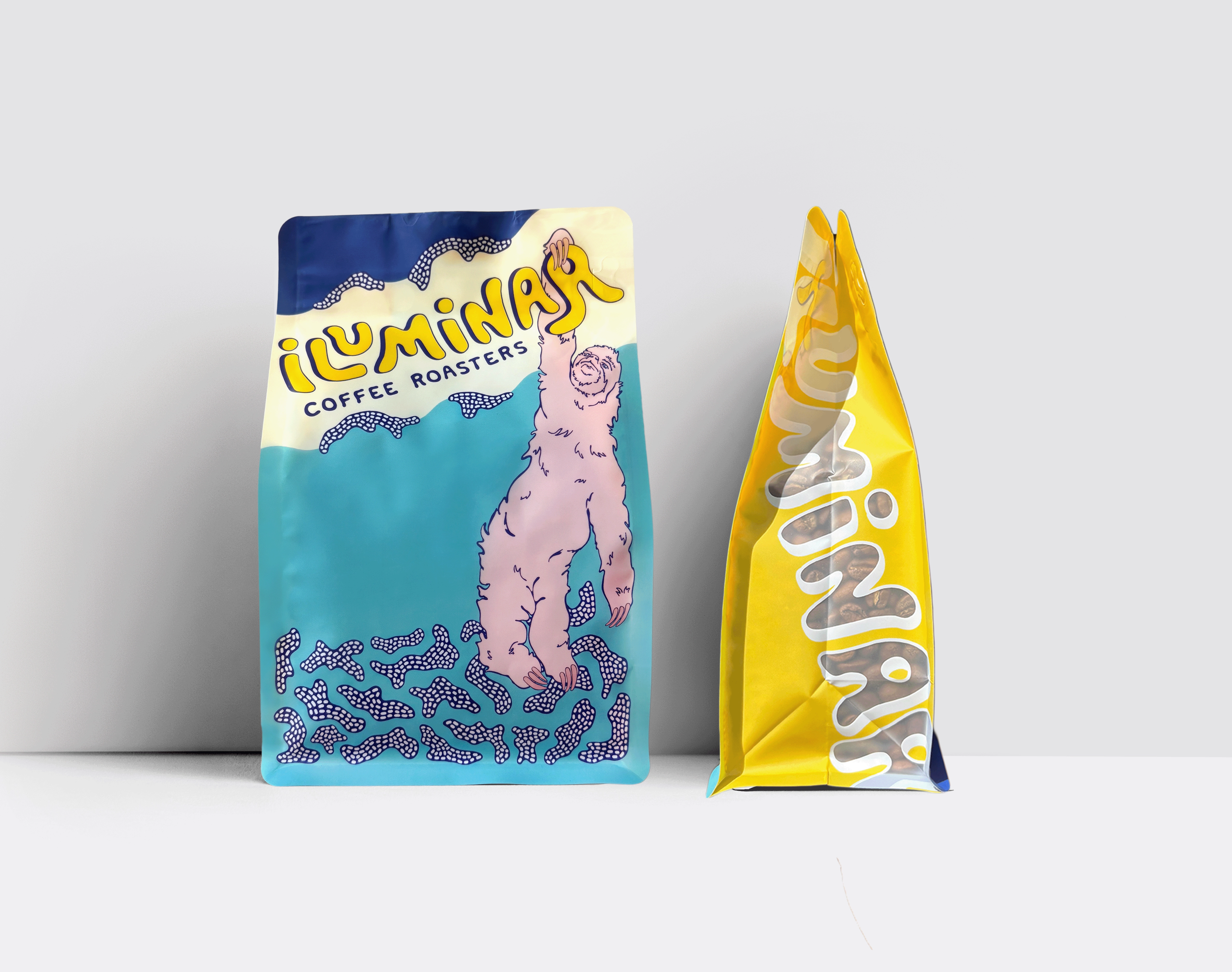
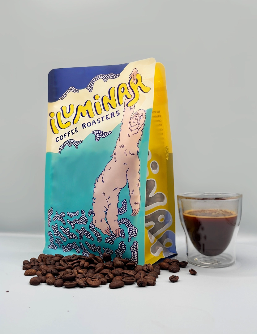
This custom 12oz retail bag was created as a flagship packaging piece for Iluminar Coffee—designed to capture the brand’s playful personality through bold illustration, expressive typography, and a fully custom back panel system. The bag balances vibrant color with clear informational hierarchy, creating packaging that stands out visually while remaining practical for customers. Every element was illustrated and built by hand in Adobe Illustrator, resulting in a one-of-a-kind packaging piece that brings Iluminar’s brand world to life.
Packaging Design • 12oz Retail Bag Design • Dieline Preparation • Layout Design • Color System Development • Product Line Extension • Production-Ready File Preparation
Adobe Illustrator • Adobe Photoshop
DESIGN CONCEPT
The concept was driven by Iluminar’s core belief in celebrating curiosity, joy, and approachability in specialty coffee. The illustrated sloth reaching upward became the central character, symbolizing exploration and the brand’s playful energy. Bright, saturated colors reflect the boldness of the brand, while organic shapes and hand-drawn textures communicate warmth and personality. The entire composition is designed to feel dynamic and inviting, creating a memorable experience for customers the moment they see the bag on a shelf or countertop.
Illustration & Character Design
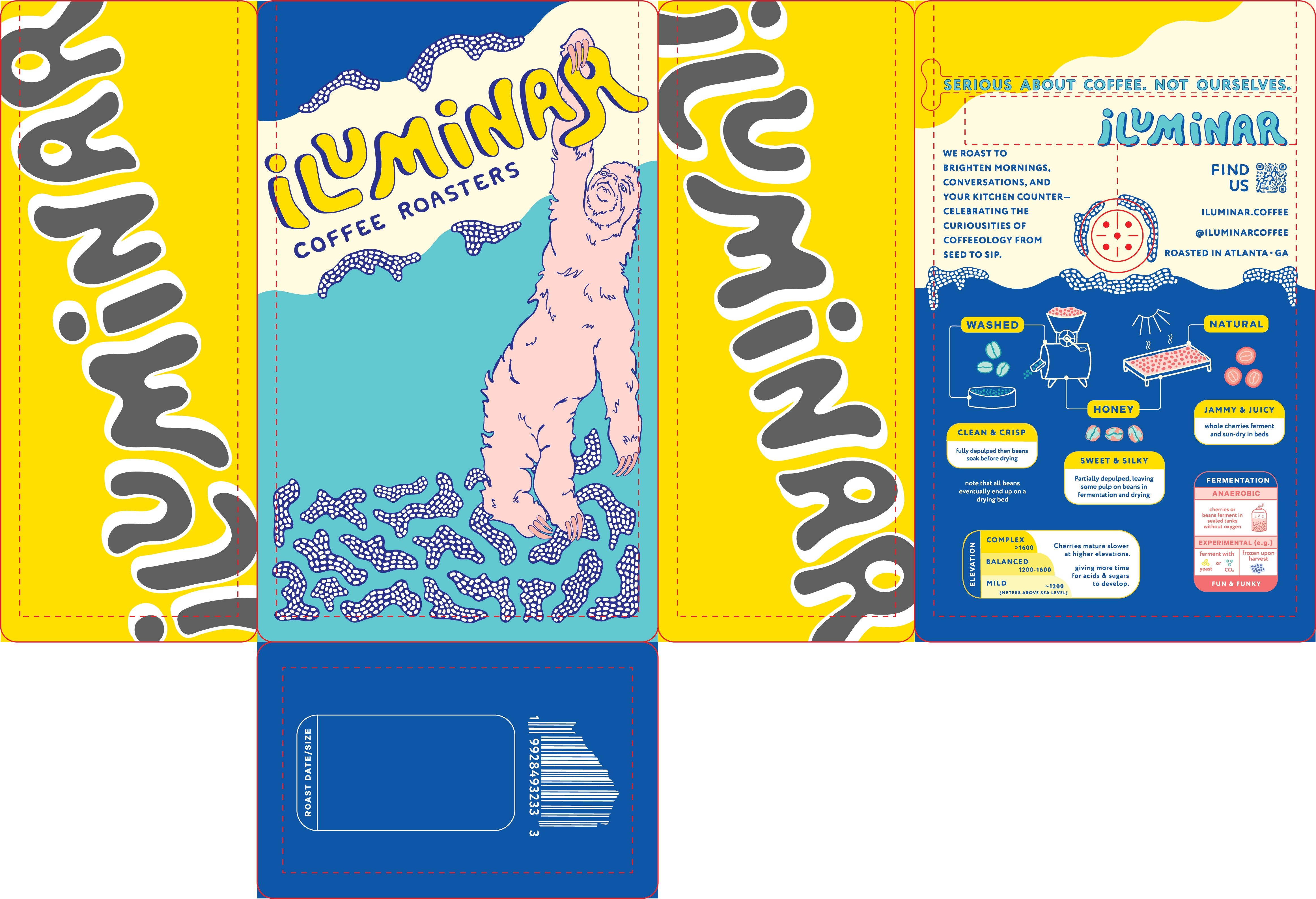
Fully hand-drawn sloth emblem serves as the primary focal point. Dot-pattern textures, signature to the brand, and organic shapes reinforce Iluminar’s playful identity. Side panel illustration transitions seamlessly from the front design, wrapping the character and typography into a continuous graphic story.
Typography
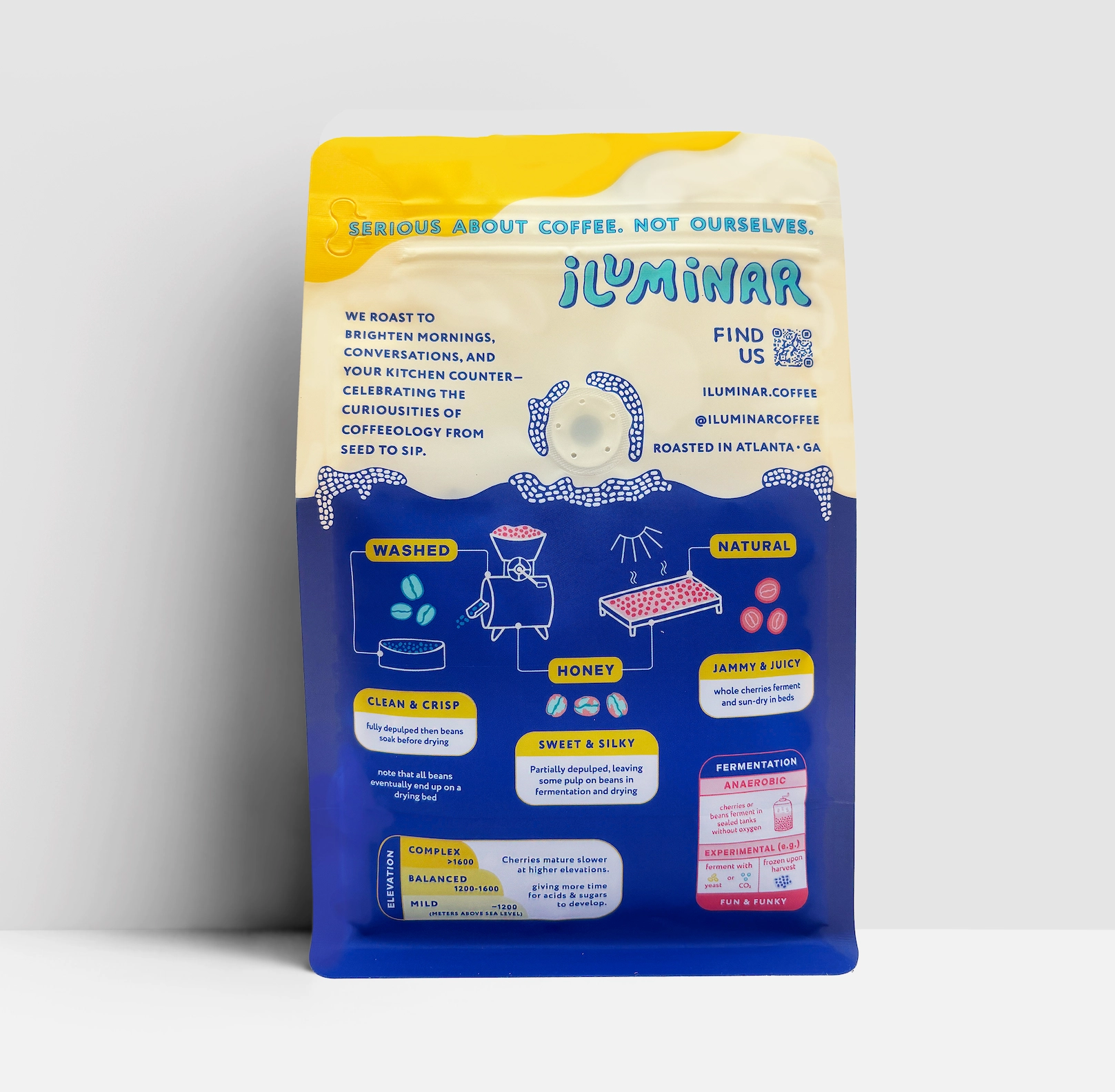
Hand-refined logotype integrates with the illustration to create a cohesive visual lockup. Clean supporting type ensures legibility for product details and brand messaging. Hierarchy organizes storytelling, contact info, and processing notes across the back panel.
Color System
Bright yellow, deep blue, and aqua tones create an energetic palette unique to the flagship bag. High saturation helps differentiate the custom bag from the white-label system and shelf competitors. Consistent accent colors tie illustration, icons, and informational sections together.
Layout & Composition
Front panel centers on the brand’s character and logotype for maximum impact. Back panel uses a structured grid to organize educational content clearly
Side panel typography aligns vertically to maintain consistency across the entire package.Negative space used intentionally to balance illustration density with clean readability.
*grey represents transparency.
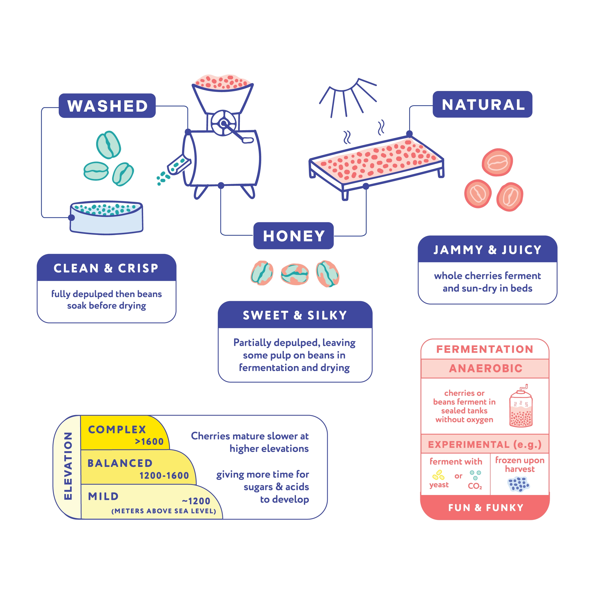
COFFEE GLOSSARY
The coffee glossary on the back panel demonstrates my ability to communicate dense information within a limited space while maintaining clarity and visual appeal. Each icon, descriptor, and definition is strategically arranged to maximize available real estate without feeling crowded. The glossary not only organizes complex concepts into an intuitive, easy-to-scan system, but also reinforces Iluminar’s mission of being informative, accessible, and playful. By combining tight spatial planning with expressive illustration, the design turns educational content into an engaging brand experience.
The design turns the bag into both a storytelling tool and a practical reference for brewing, reinforcing the brand’s goal of being serious about coffee, not ourselves.
The system includes:
-
Illustrated icons for processing methods (Washed, Honey, Natural)
-
Flavor spectrum blocks with short, clear descriptors
-
Fermentation callouts for experimental lots
-
A structured brew guide using diagrams instead of text-heavy instructions
-
Brand mission and contact information integrated into a clean, easy-to-read layout