THE INTERNET PHONE BOOK
EDITORIAL STUDY & PUBLICATION DESIGN
Editorial Design · Publication Layout · Typographic Systems · Research & Writing · Concept Development · Image Editing · Visual Storytelling
Adobe InDesign · Adobe Photoshop · Adobe Illustrator · Flatbed Scanning & Image Adaptation
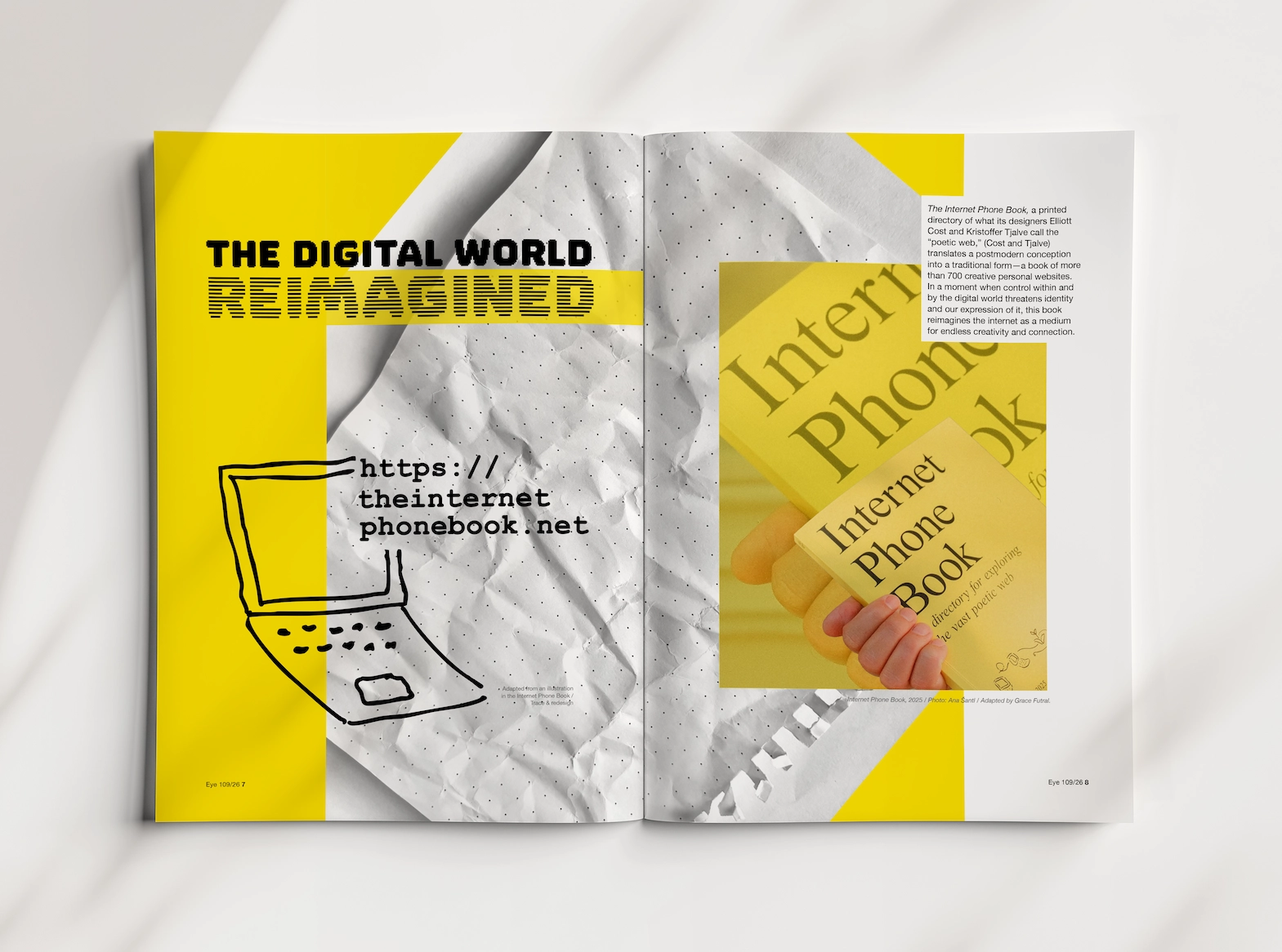
The Internet Phone Book is a printed directory of the “poetic web”—a book that turns personal websites into something you can hold, flip through, and browse with intention.
For this project, I wrote a theoretical essay on the book then translated that writing into a multi-spread editorial feature modeled after Eye Magazine (Issue 106).
The result is a hybrid piece: part design criticism, part publication design. The spreads are structured to mimic the feeling of searching the web and navigating The Internet Phone Book itself. Turning pages becomes an act of browsing.
The core question: How can print design make the internet feel human, slow, and tangible again?
DESIGN CONCEPT
The magazine as a physical “interface” for the poetic web:
1) Modernist grid as empathy, not authority
I use a rational, Eye-inspired grid and restrained typography to echo the phone book’s neutral structure. The system isn’t there to dominate, but to make hundreds of small presences legible and cared for.
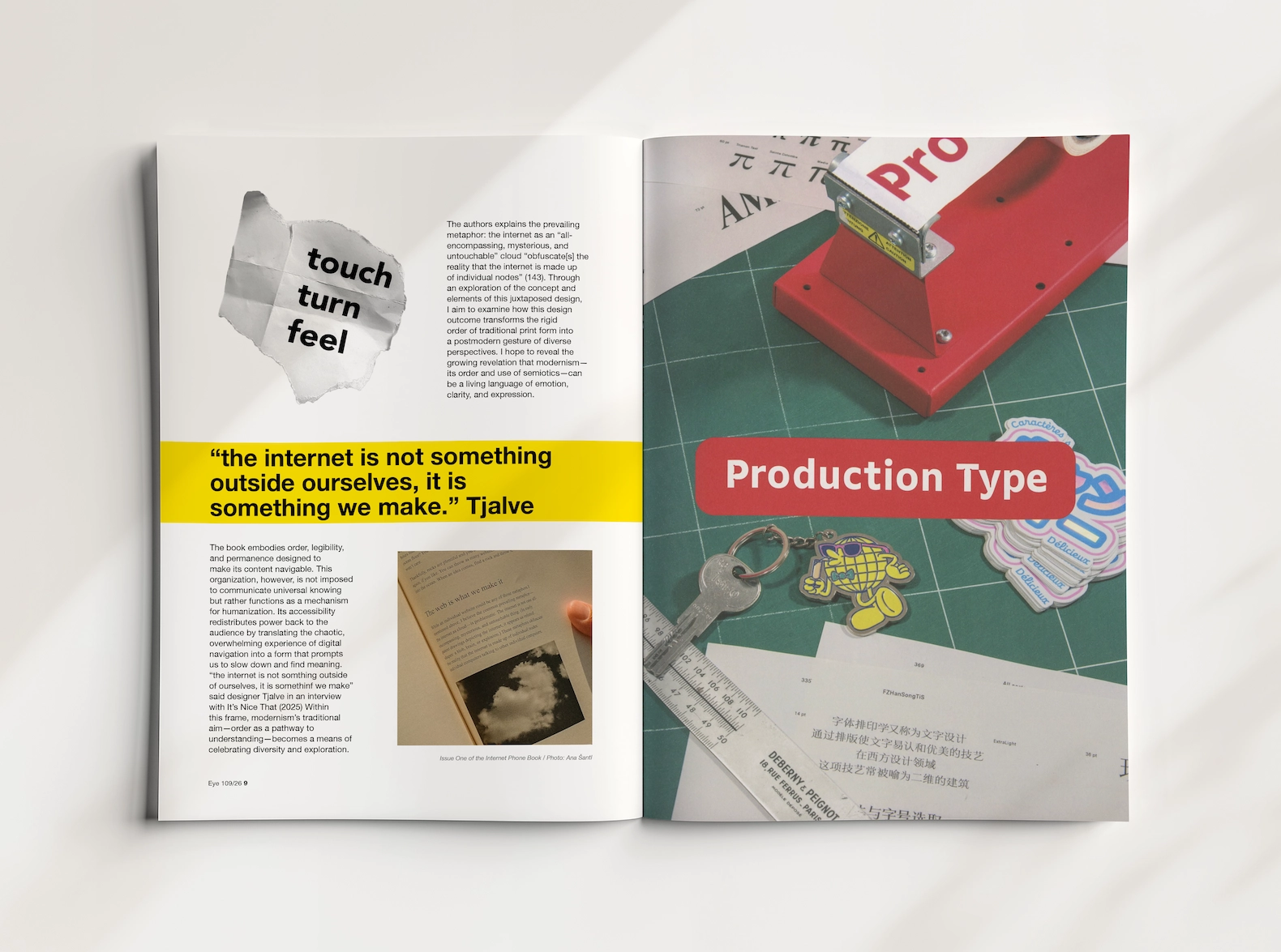
2) Tactility as counterpoint to digital smoothness
Crumpled paper, scanned textures, and hand-drawn elements (like a loose laptop sketch) introduce friction. They visualize what the project is arguing for: that design can slow us down and give weight back to information.
3) Scanned Eye spreads as “browsing interludes”
Actual spreads from Eye Issue 106 are scanned and woven into the sequence. They aren’t just references. They function like links or new tabs, forcing the reader to pause and reorient, just as you would when clicking through the web or paging through the Internet Phone Book.

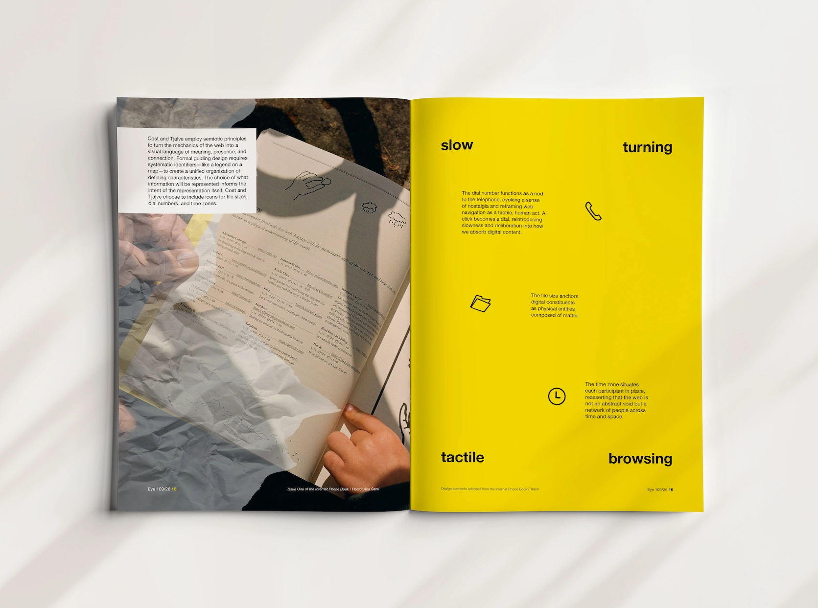
4) Semiotics and authorship made visible
Icons for file size, time zone, and dial numbers, adapted from the book, appear as semiotic cues. Image credits and adapted drawings are carefully cited, underlining my argument that even “neutral” systems carry the designer’s hand.
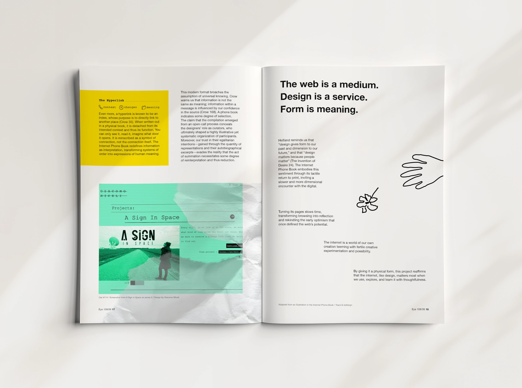
The web is a medium. Design is a service. Form is meaning.
This project became an experiment in how editorial design can translate the immaterial web into something slow, tactile, and human. By weaving scans from Eye Magazine with my own layouts, I wanted each page turn to echo the act of browsing: a moment of discovery, disorientation, and connection. In the end, this piece is about the quiet power of form, how structure can create meaning, and how design can remind us what it feels like to truly look.