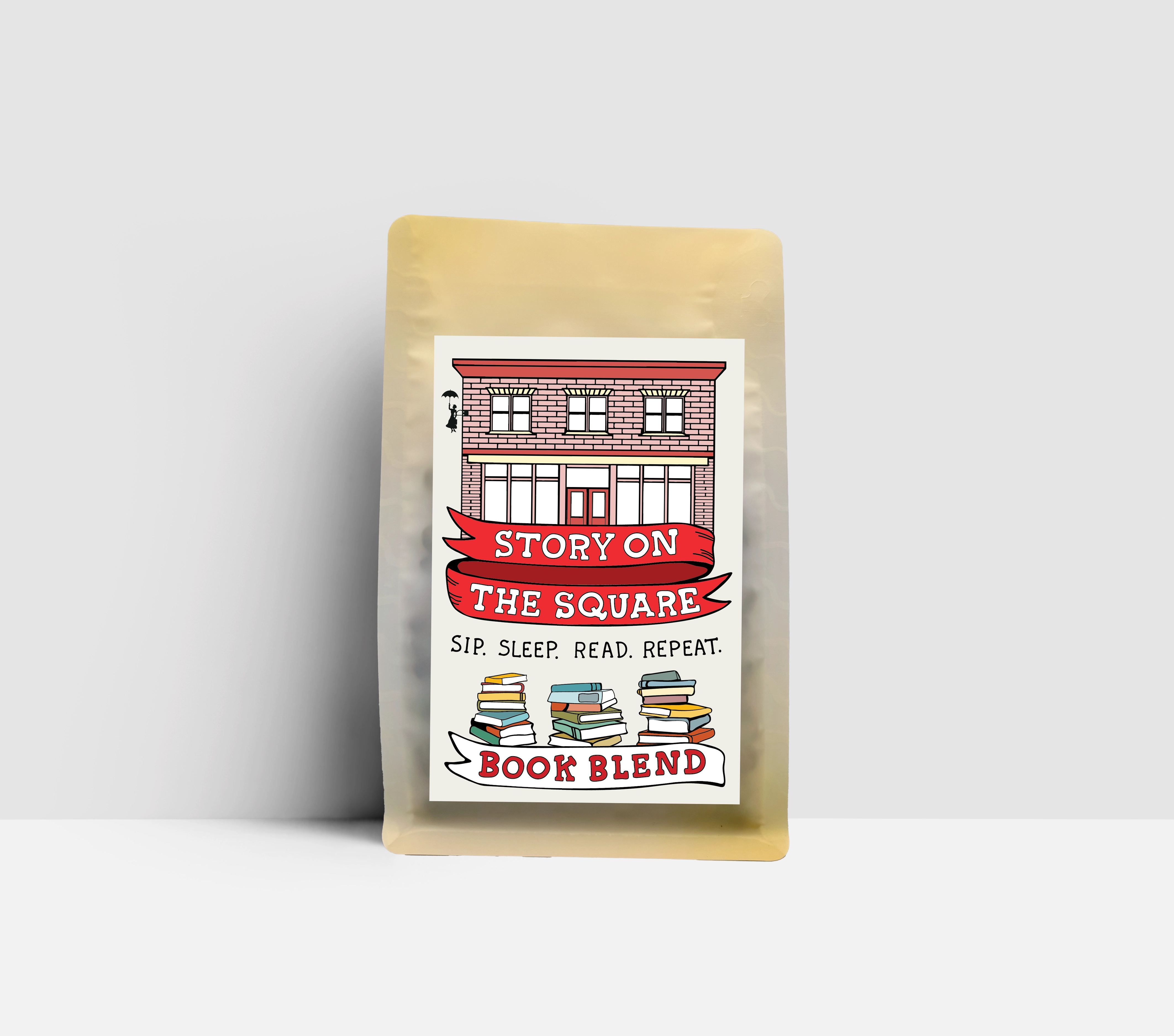
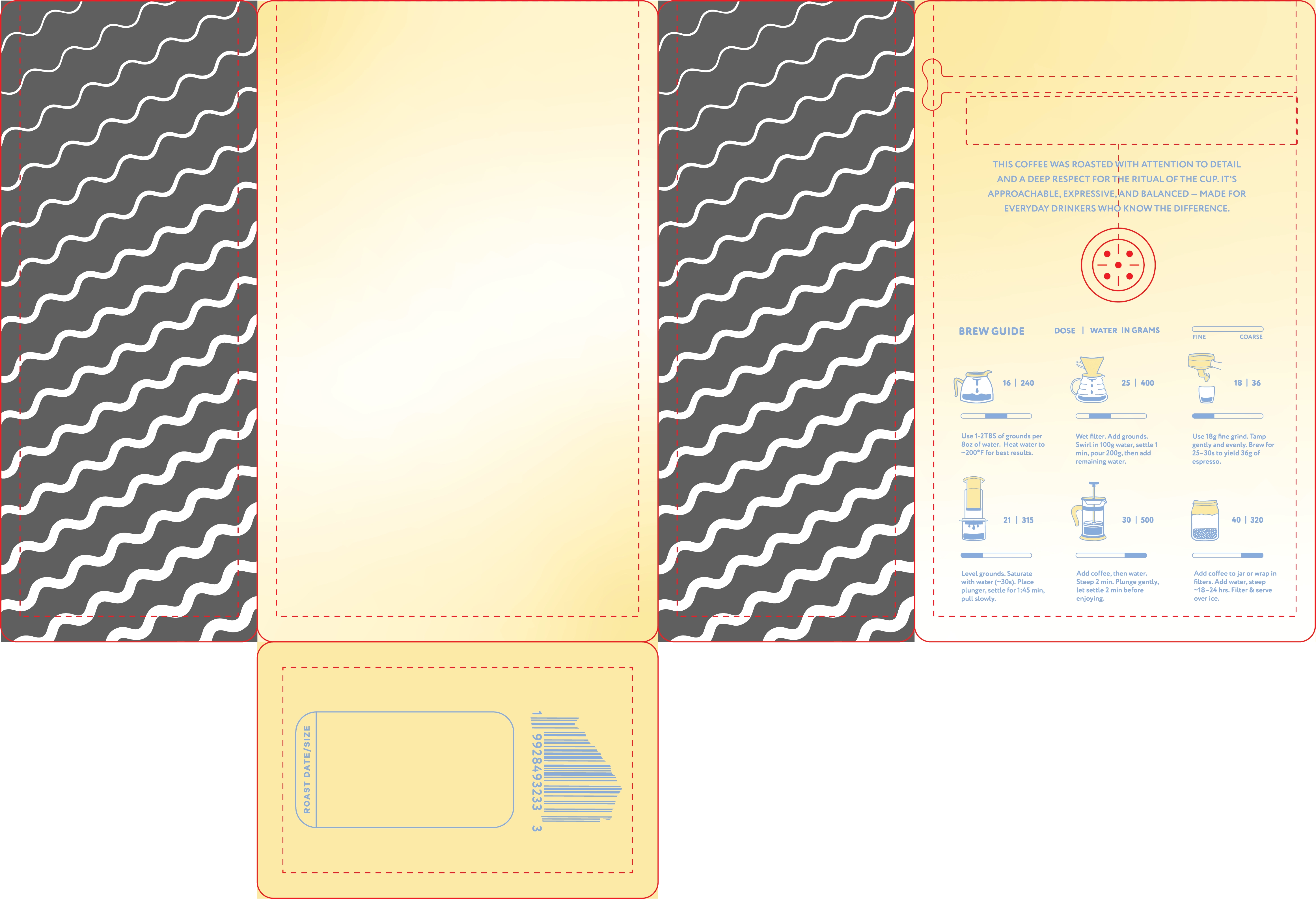
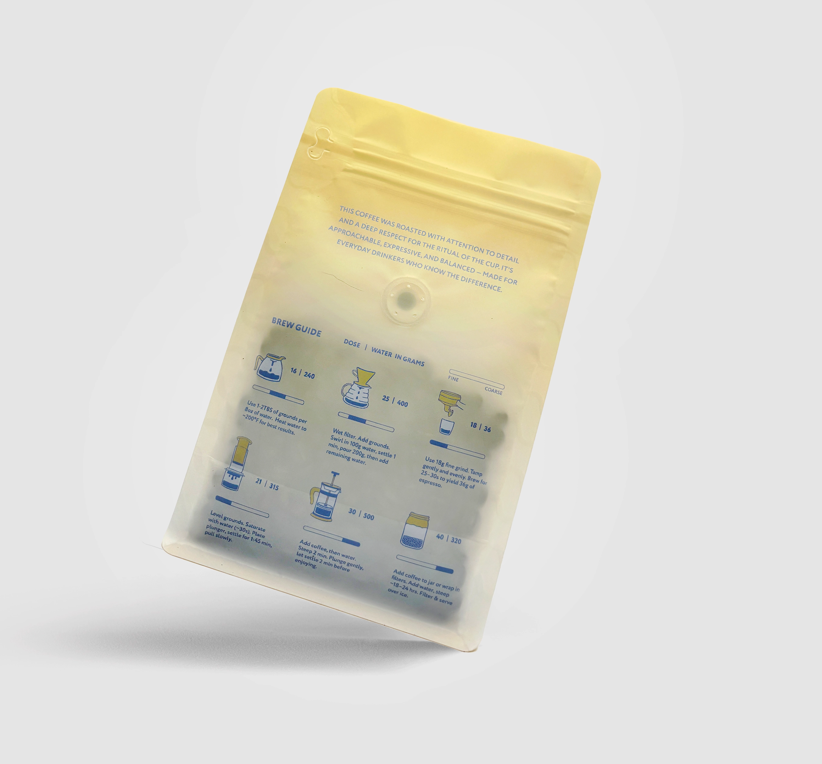
WHITE LABEL BAGS
This 12oz white label bag was designed as a universal packaging solution for Iluminar’s wholesale accounts—simple, flexible, and adaptable to any coffee offering. The goal was to create a clean base bag that could pair seamlessly with the 2×3 origin labels, allowing quick turnaround for wholesale partners without compromising brand consistency. The design prioritizes clarity and functionality while still aligning with Iluminar’s playful and approachable visual identity. This bag is the backbone of the brand’s day-to-day operations, used across dozens of coffees and customers.
Packaging Design • Information Design • Illustration • Layout Systems • Wholesale Product Strategy • Production-Ready File Preparation
Adobe Illustrator • Adobe Photoshop
DESIGN CONCEPT
The concept centers on flexibility and brand cohesion. The matte white bag acts as a neutral canvas, allowing the bold 2×3 labels to stand out while maintaining a unified Iluminar presence across all wholesale offerings. The back panel features a fully illustrated brew guide—designed to be informative, friendly, and easy to follow—making the bag useful to both seasoned coffee drinkers and newcomers.
The simplicity of the front allows for limitless variation through labels, while the illustrated back panel ensures that every bag still feels distinctly Iluminar, whether placed on a café shelf, a grocery store lineup, or a home kitchen.
Front Panel
-
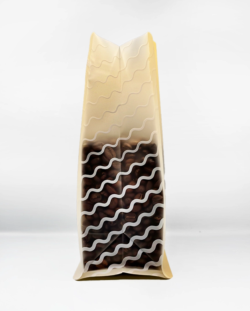
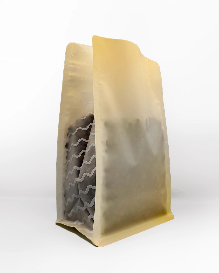
Pure white matte finish designed to pair with any 2×3 coffee label
-
Minimal branding to keep the focus on the origin label and product information
-
Clean presentation for wholesale shelves and multi-roaster environments
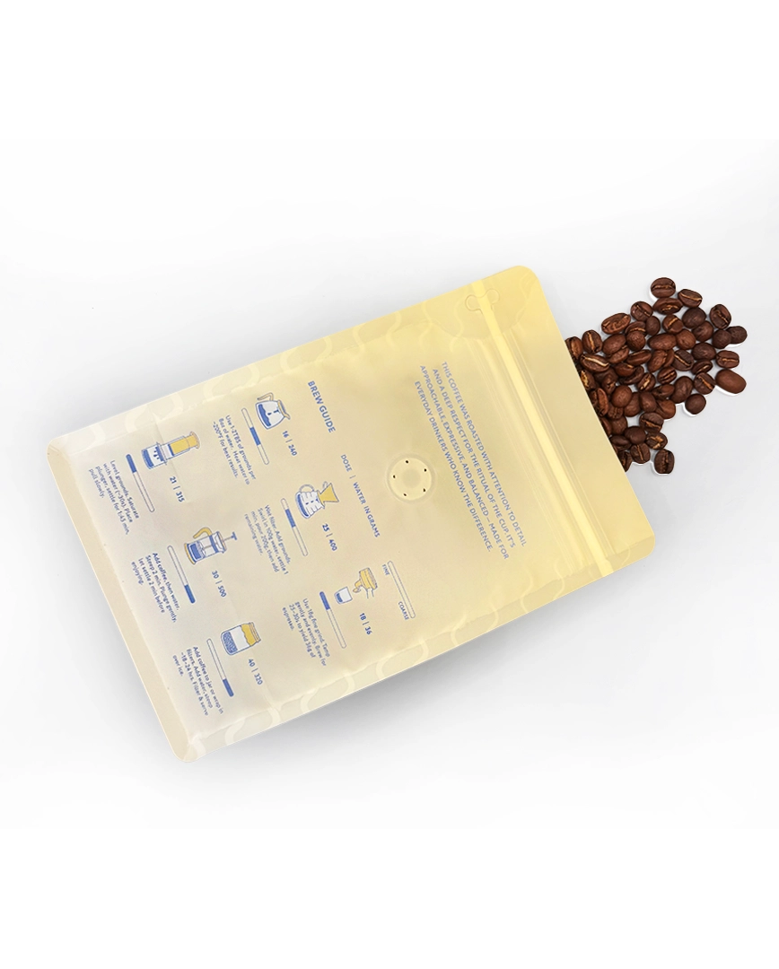
Back Panel
-
Illustrated brew guide designed entirely by hand in Illustrator
-
Icons and diagrams make the instructions approachable and friendly
-
Clear hierarchy organizes methods and measurements for quick scanning
-
Brand message and contact information integrated into the composition
-
Works for customers new to specialty coffee and experienced brewers alike
Color System
-
Soft, translucent yellow interior hinting through the bag adds warmth
-
Blue and yellow ink on the back panel ties into Iluminar’s established brand palette
-
High-contrast line illustrations ensure legibility on a light bag surface
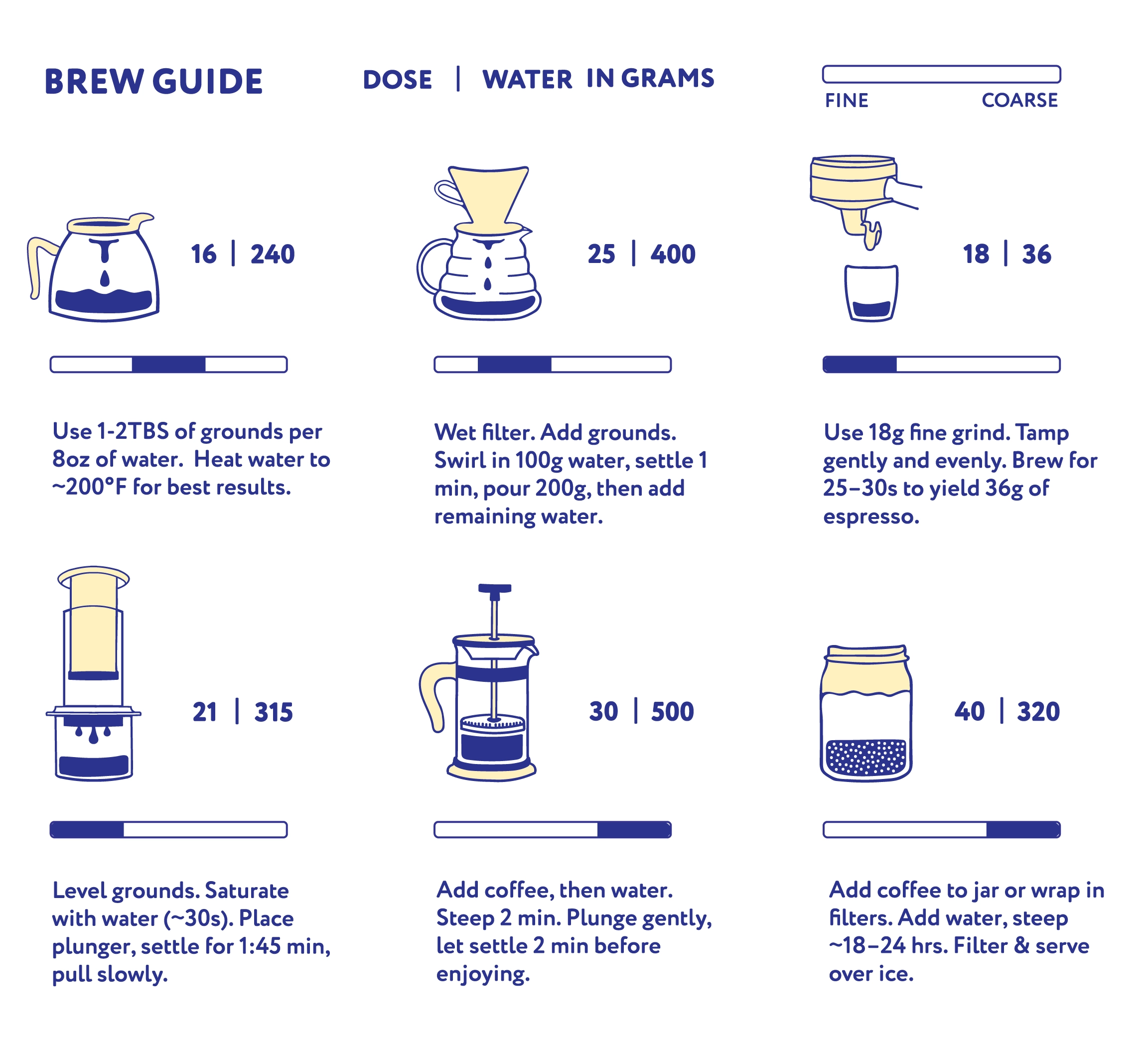
BREW GUIDE
The illustrated brew guide demonstrates the ability to communicate clear, educational content in minimal space. Each method—V60, AeroPress, French Press, and more—is represented through concise icons, short instructions, and simple measurement indicators. The system is designed to maximize the back panel without feeling cramped, blending information design with playful illustration to reinforce the brand’s mission of being approachable, helpful, and fun.