COFFEE LABELING SYSTEM
The Iluminar Coffee Label System was designed to support a constantly evolving lineup of coffees while maintaining strong brand cohesion. Built as a modular 2×3 inch format, the labels provide a flexible framework that can rapidly adapt to single origins, blends, microlots, and rotating releases. Each label uses bold color fields and a clean typographic hierarchy to communicate essential information clearly, whether displayed on retail shelves or paired with the brand’s white label wholesale bags.
The system balances expressive color with structured organization, creating packaging that is both instantly recognizable and highly functional.
Packaging Design • Label System Development • Color Theory • Information Design • Layout Design • Production-Ready File Preparation • Brand Extension
Adobe Illustrator • Adobe InDesign


DESIGN CONCEPT
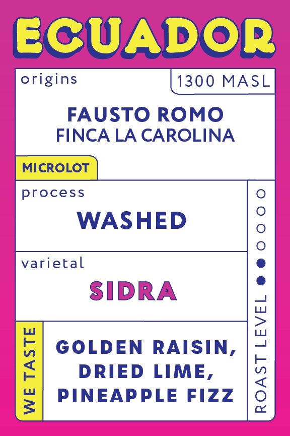
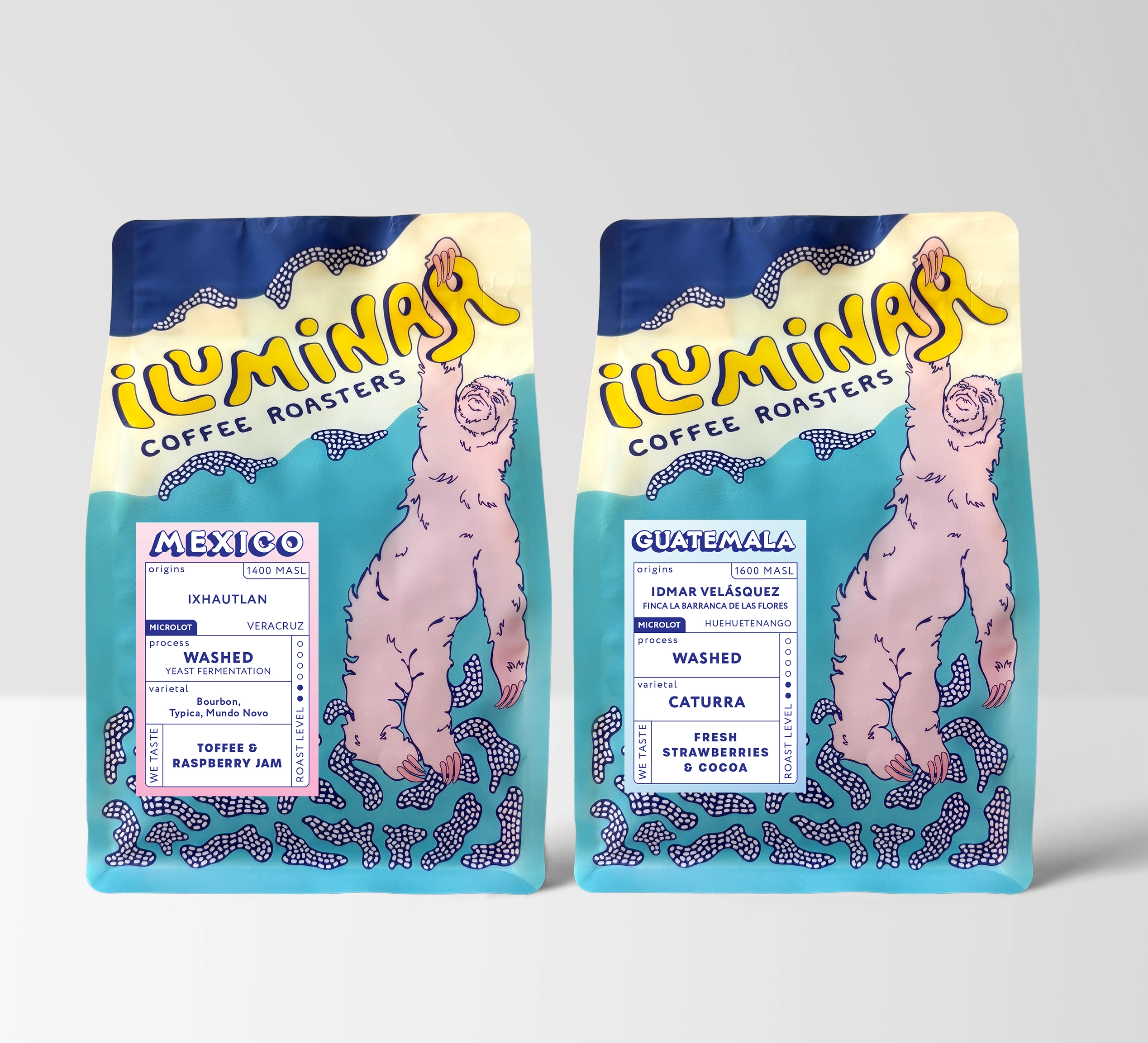
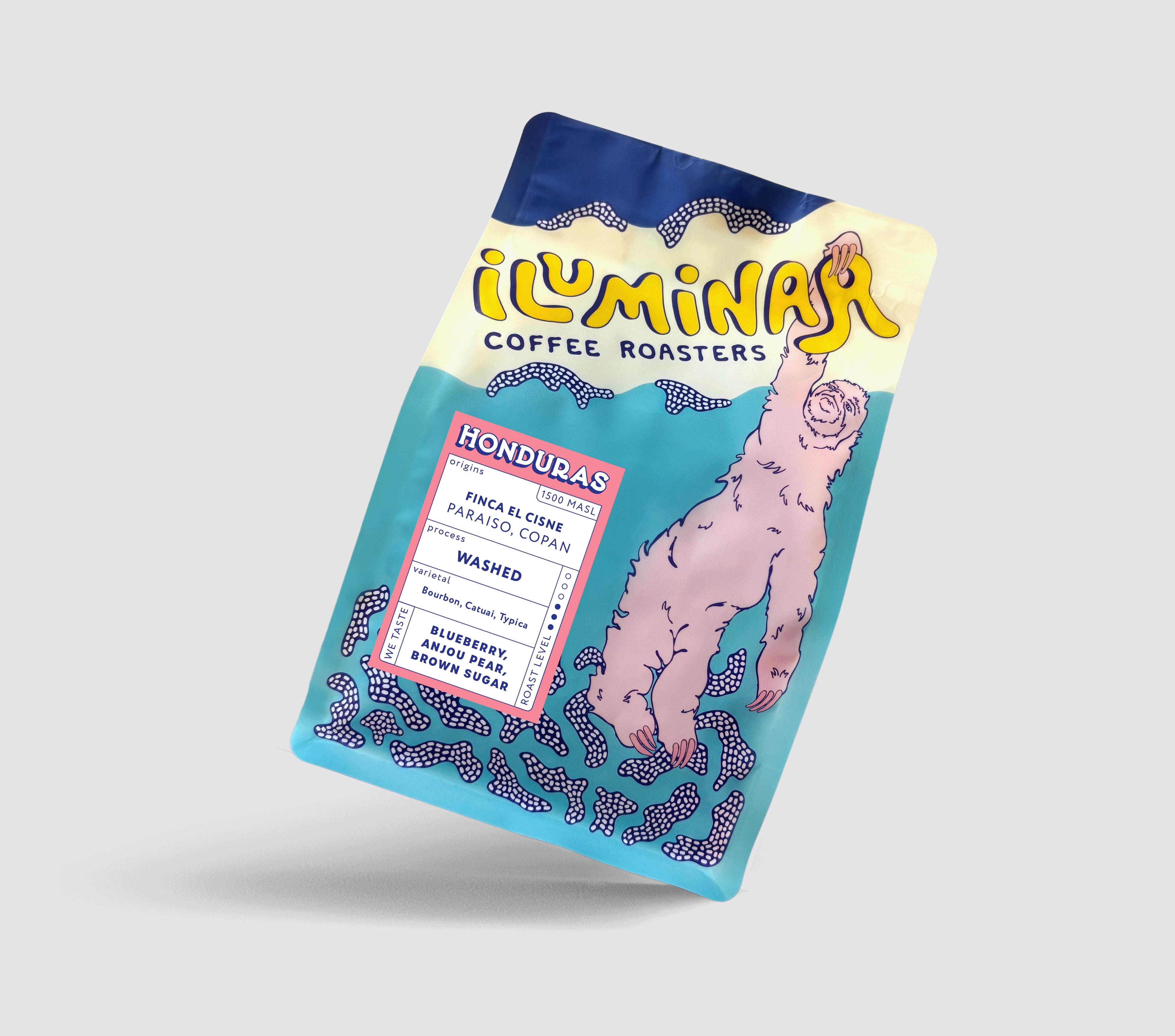
The concept for the label system was guided by clarity, scalability, and visual distinction. Each origin receives its own defined color palette, giving the lineup a vibrant, collectible quality while preserving consistency across the series. The structured vertical grid allows complex information—origin, farm, elevation, varietal, process, and tasting notes—to be presented in an intuitive, easy-to-scan layout.
This system-driven approach lets Iluminar maintain brand clarity across growing product lines, while still allowing each coffee to feel unique and intentional. The result is a label series that is systematic, efficient, and expressive, fully aligned with the brand’s playful yet modern identity.
Typography
-
Sans serif typography chosen for clear hierarchy and readability at small scale
-
Consistent typographic structure organizes origin, process, varietal, and tasting notes
-
Vertical orientations maximize space within the 2×3 form factor
-
Bold type for key identifiers ensures quick recognition on shelves
Color System
-
Each coffee receives its own distinct color palette for instant differentiation
-
High-contrast combinations enhance legibility
-
Blends use gradient fields to convey complexity and rotation
-
System maintains brand cohesion through consistent accent colors and typographic treatment
Layout & Grid
-
Built on a three-column modular vertical grid
-
Key information zones—origin, process, varietal, tasting notes—are locked to consistent positions
-
“Roast Level” icons unify the series visually
-
Designed to feel structured without feeling rigid, allowing the system to adapt based on content