DESIGN CONCEPT
Bear Sight is a brand shaped by the spirit of exploration and the quiet power of the natural world. Inspired by the visual language of trail markers, ranger badges, and the rugged geometry of the wilderness, Bear Sight captures the energy of outdoor adventure through a bold, character-driven identity. The brand draws from the balance of strength and approachability found in nature—where solid forms meet soft edges, and movement is guided by instinct.

Visual Identity Design • Brand Development • Website Design • Merchandise Design • Social Media Design
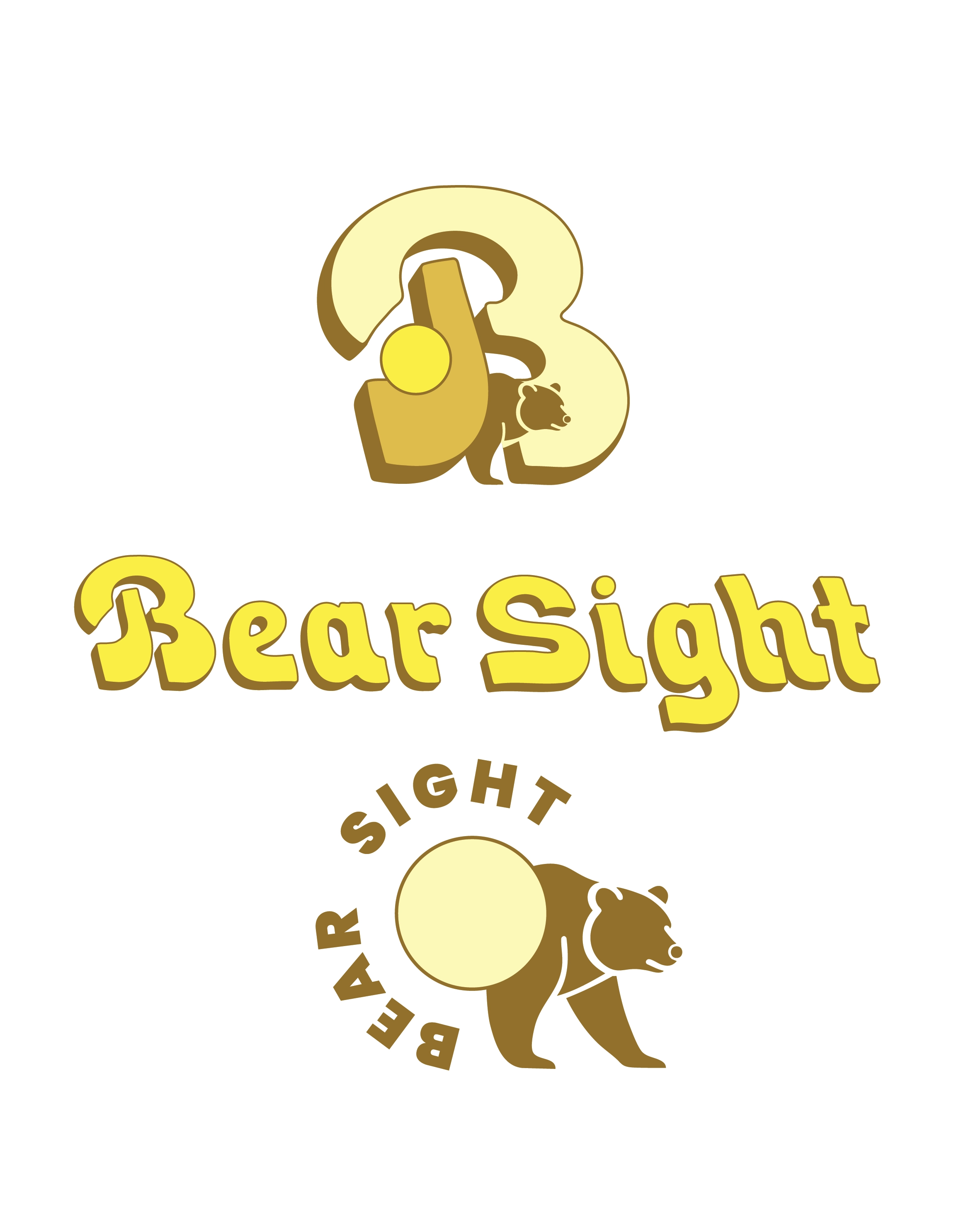
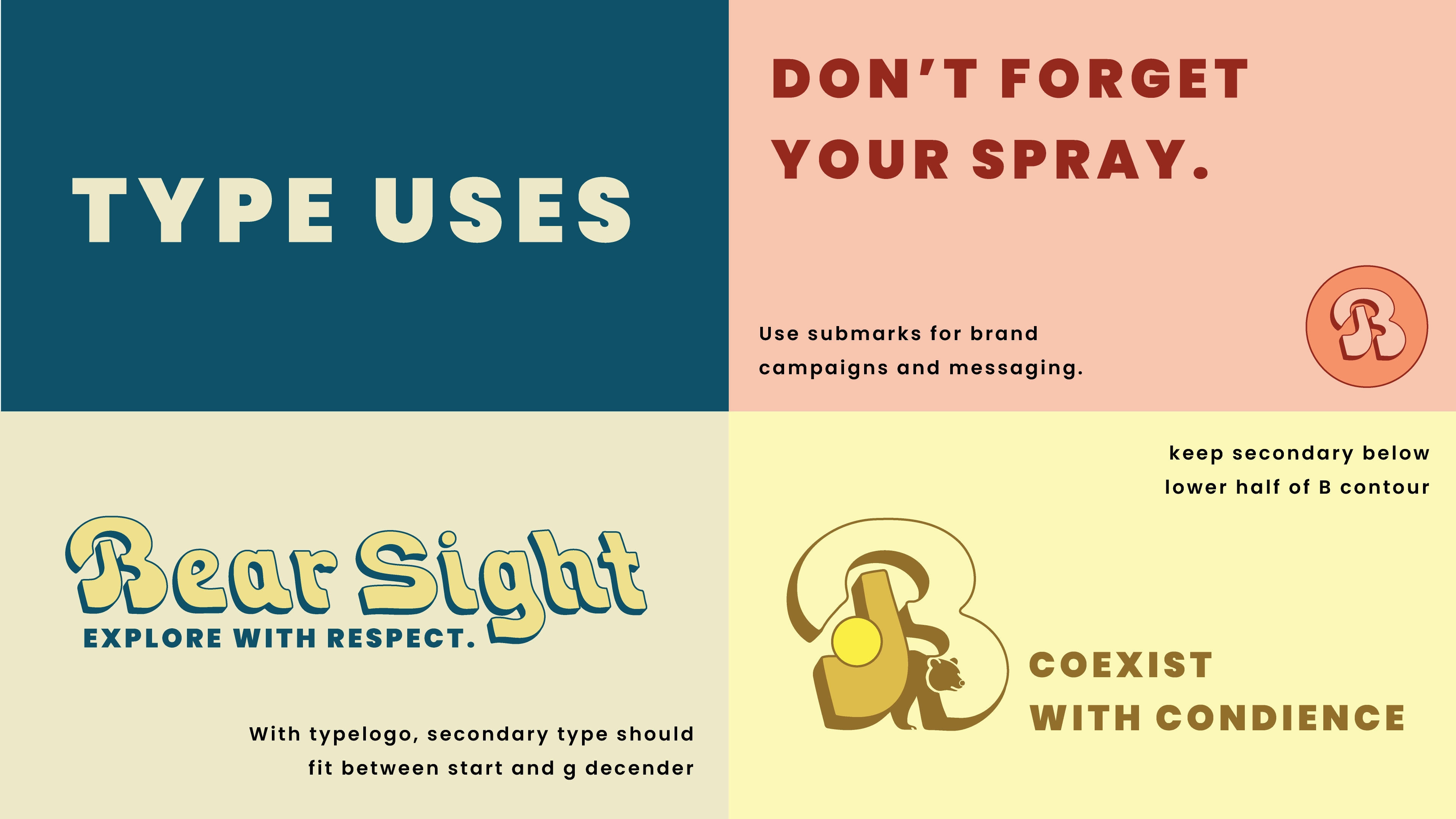
The custom Bear Sight typeface forms the visual backbone of the identity, embodying clarity, sturdiness, and directional purpose. The brand inhabits a world where natural terrain meets structured design: rugged enough to stay grounded, precise enough to carry across digital platforms. By evolving the initial type experiment into a full identity system, the project demonstrates how typography can drive brand voice, layout logic, and visual consistency — enabling Bear Sight to adapt across apparel, merchandise, web, and environmental graphics.
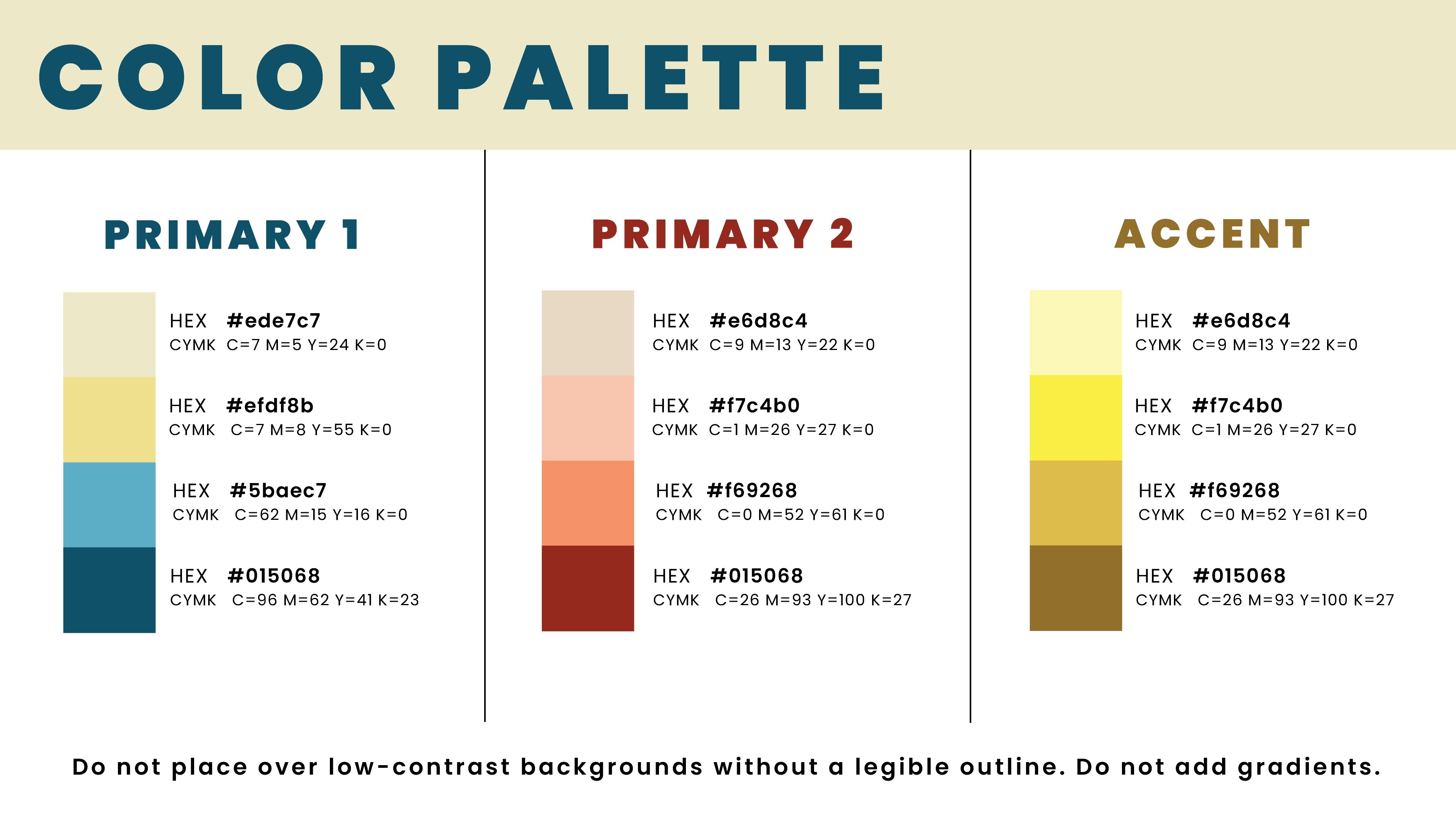
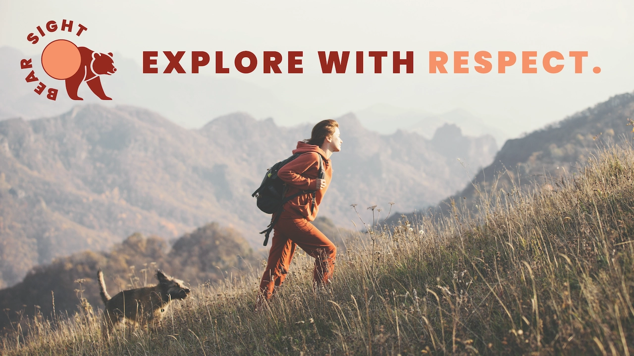
A deep forest green anchors the brand, paired with neutral earth tones and crisp accent color for directional cues. Color usage aligns with outdoor references (trail maps, signage) while retaining a modern graphic aesthetic.
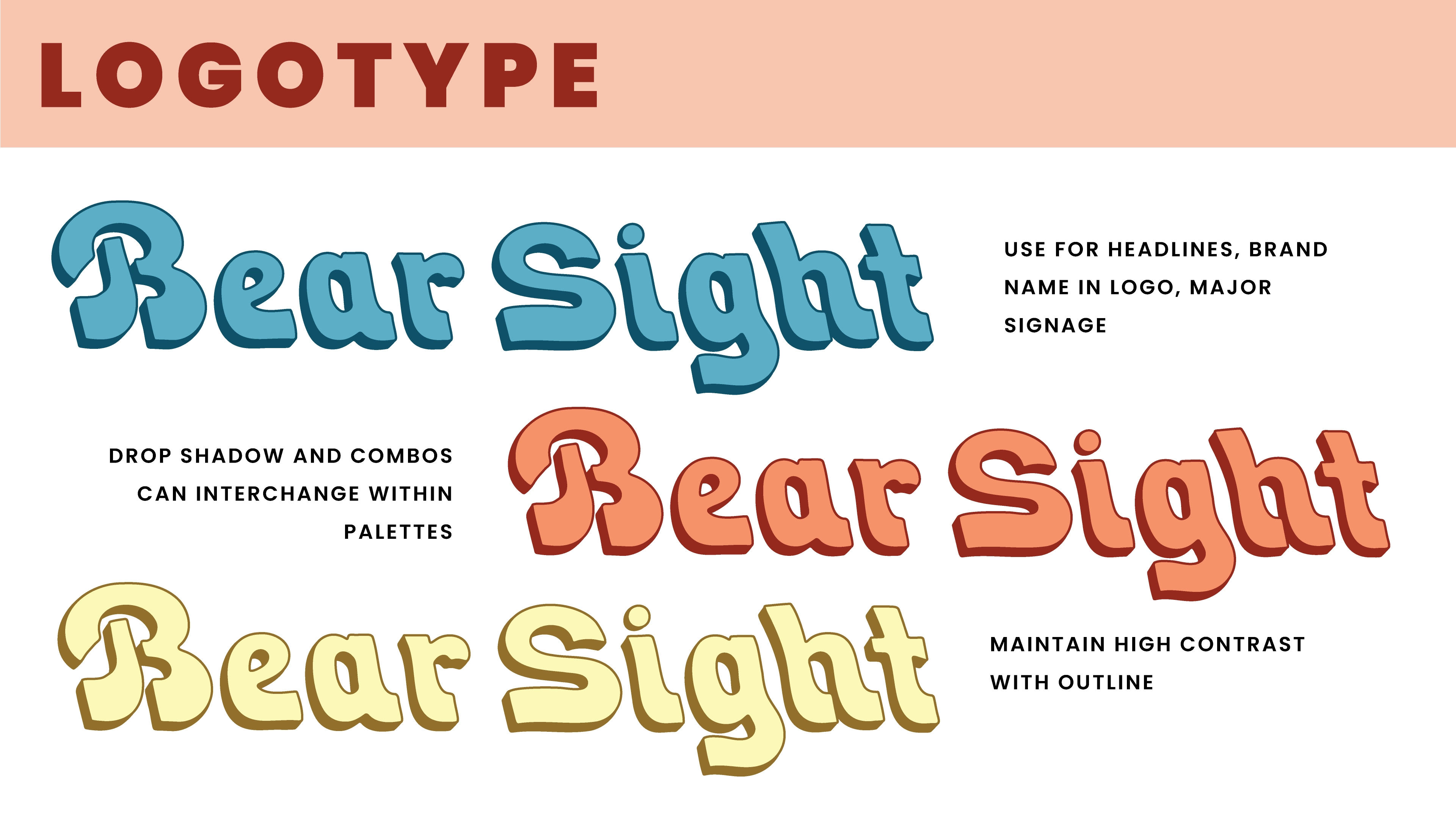
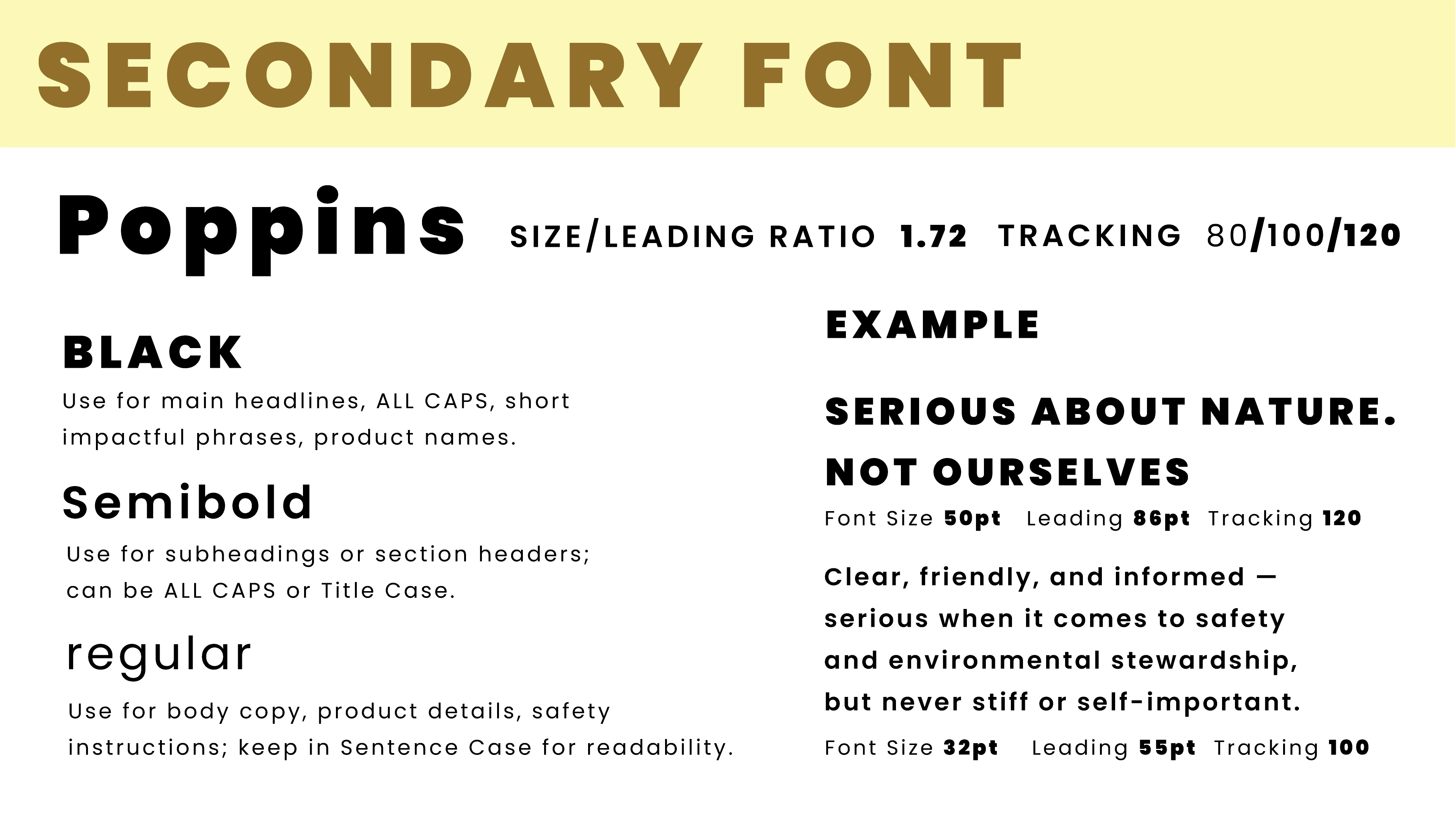
Custom display typeforms rooted in the original “Bear Sight” font exploration. Bold weights for logotype; secondary sans serif for supporting text. Consistent letter-spacing and corner treatments maintain brand personality across sizes.
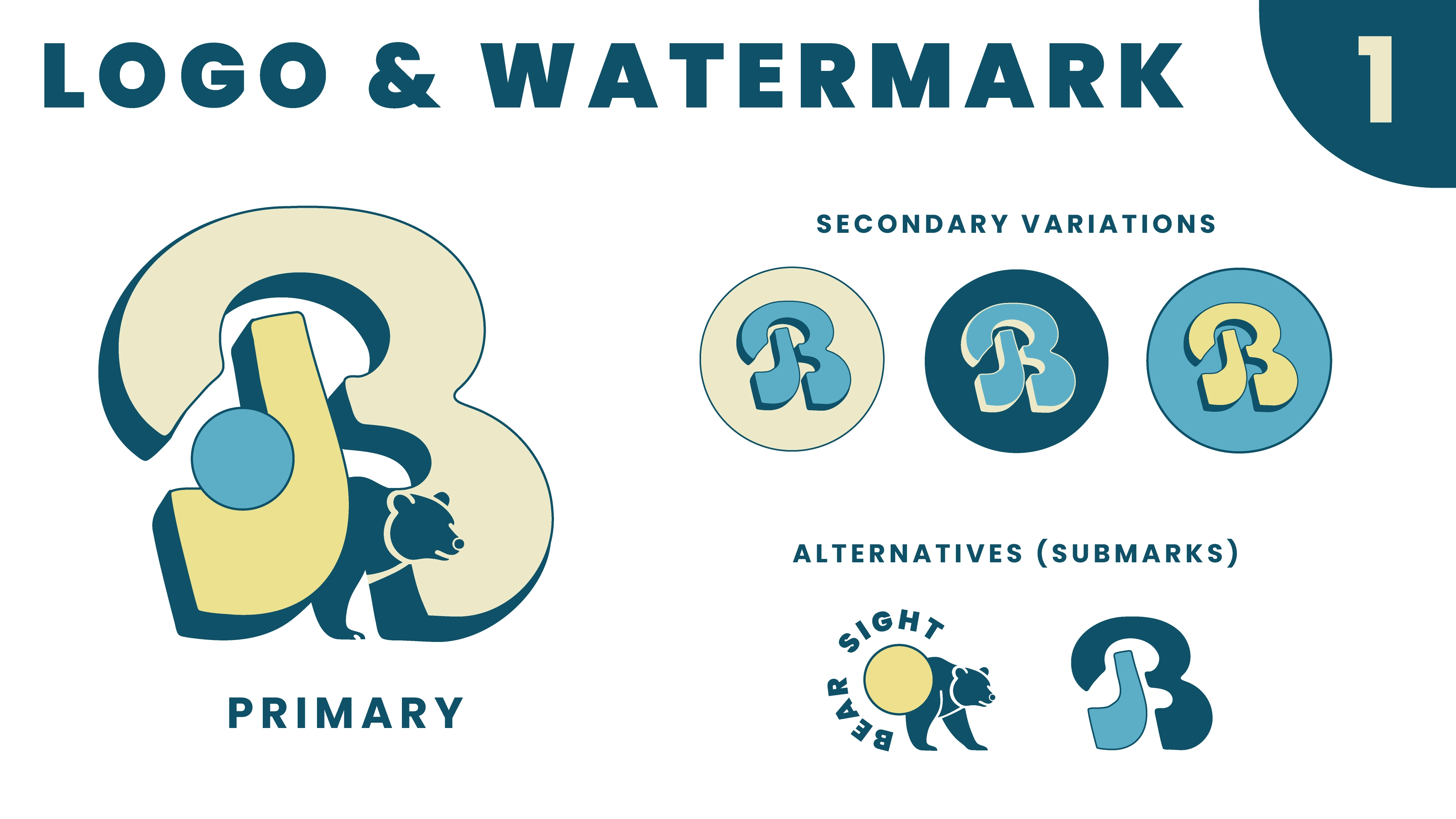
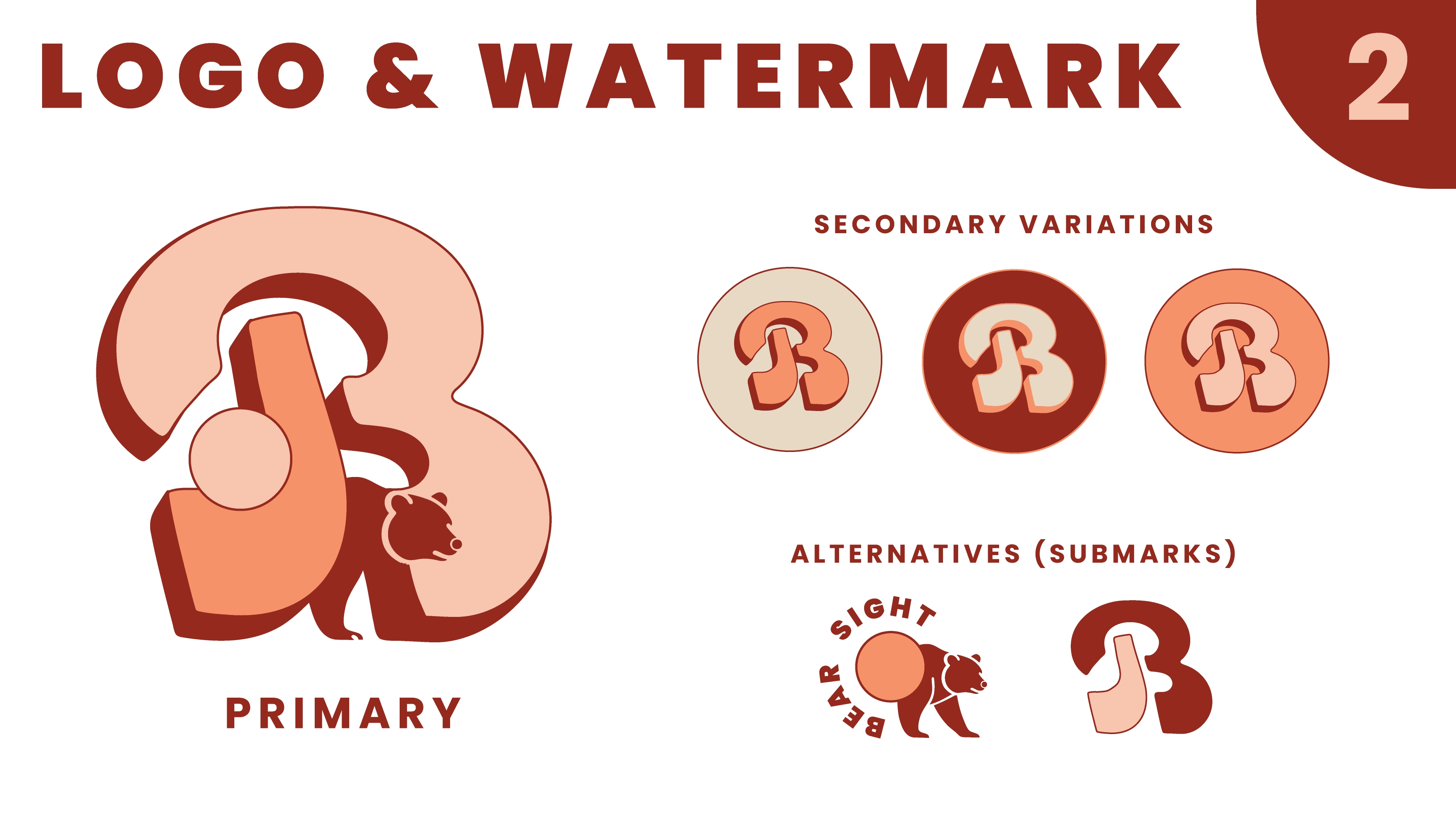
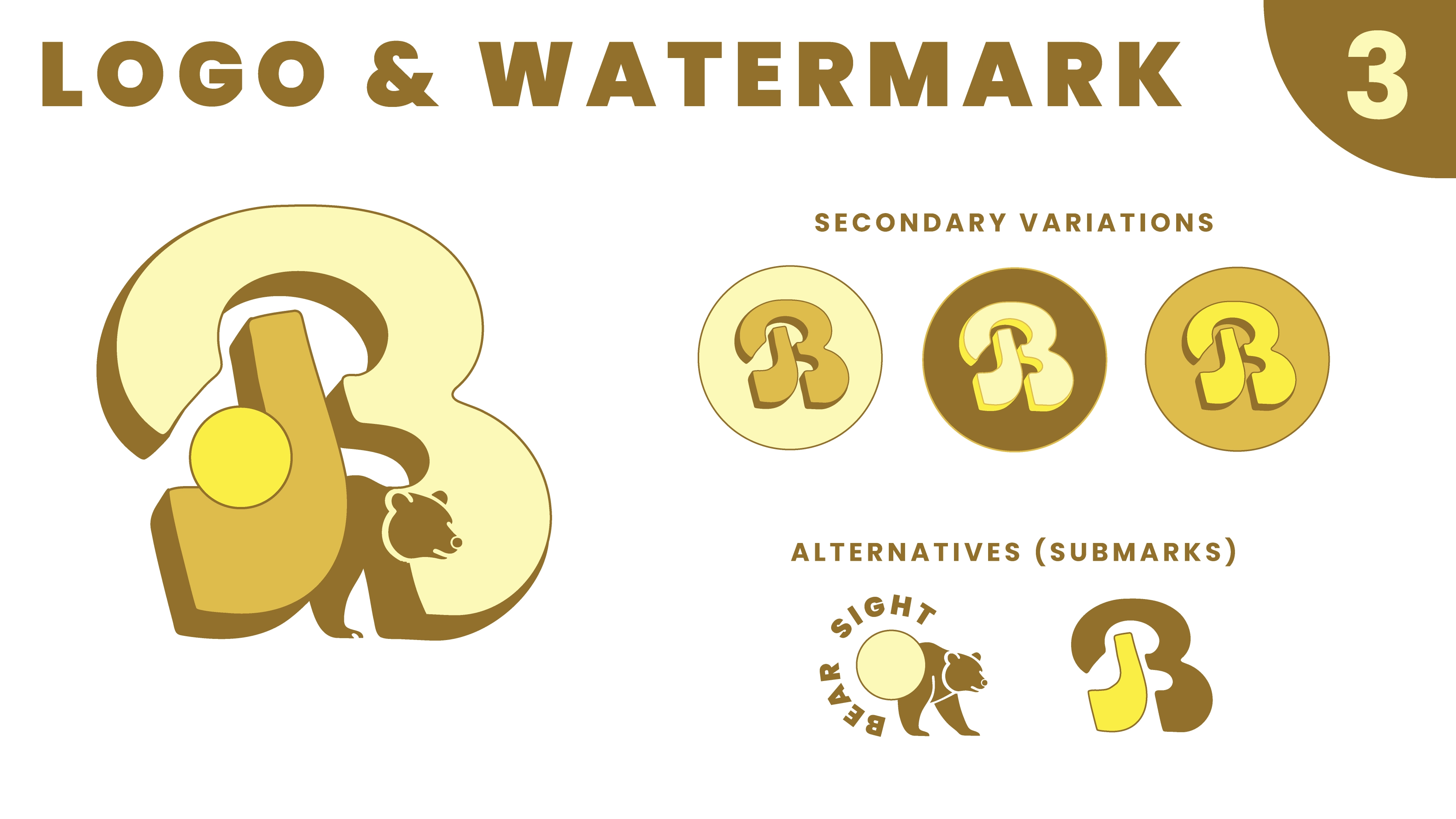
Primary logotype transitions seamlessly from web header to hat embroidery. Secondary marks and badges provide alternate lock-ups for merchandise. Imagery treatment uses high-contrast typography overlaying environment photography for dynamic brand extension.