
FLORA PACKAGING & IDENTITY
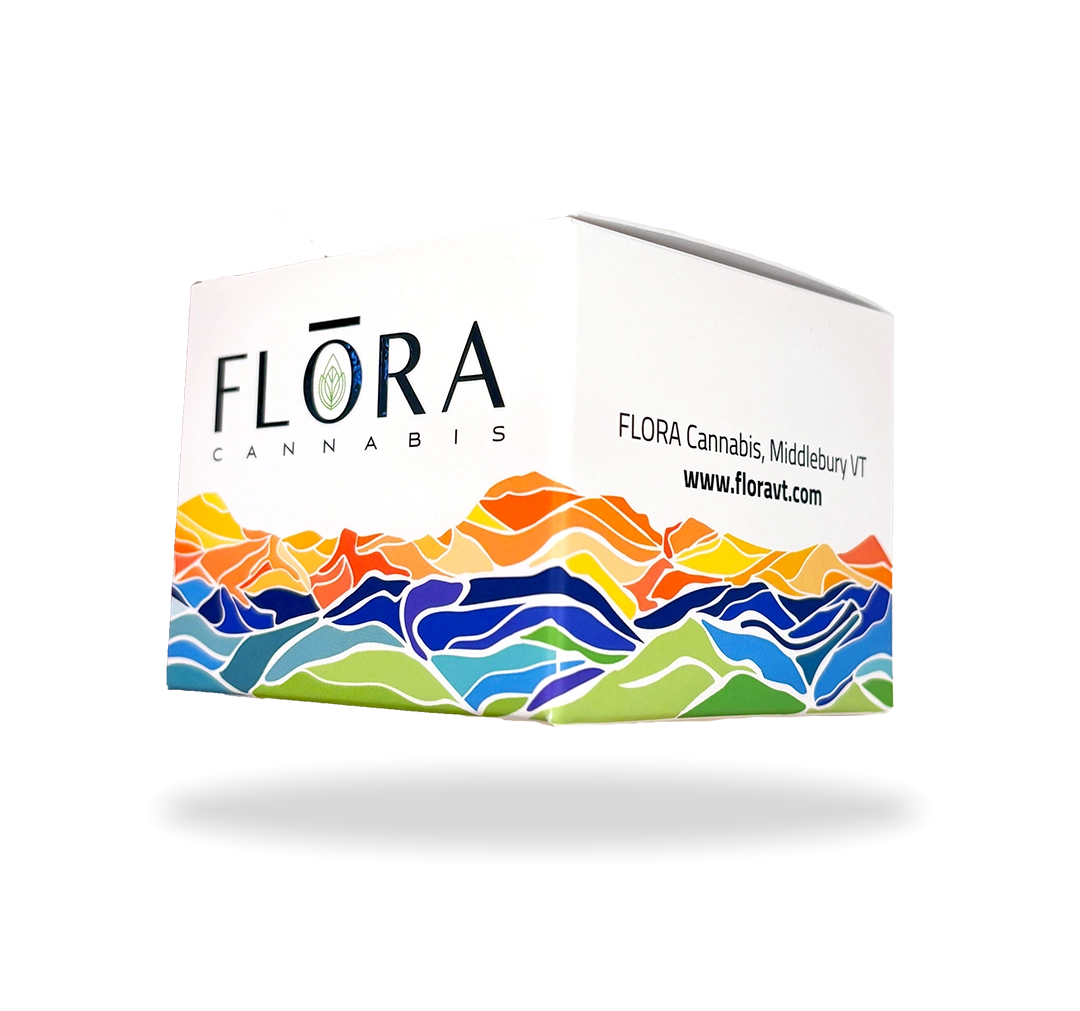
Flora Cannabis—Vermont’s first recreational cannabis retailer—commissioned a packaging system for their 3.5g flower products. The client requested a design inspired by the Green Mountains with artwork that wrapped around all sides of the box, creating a bold but tasteful retail presence.
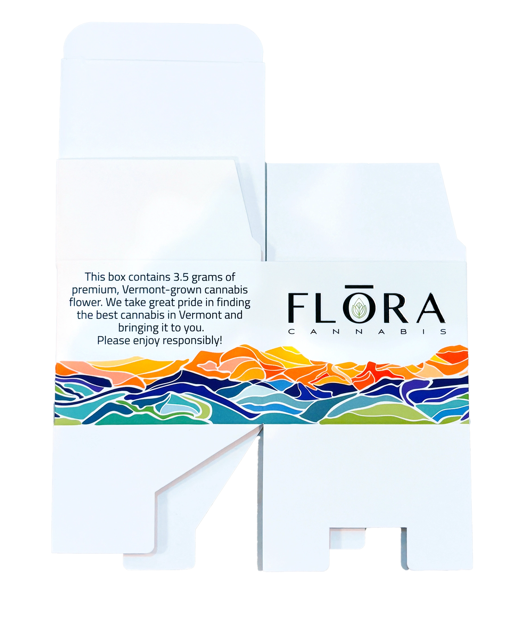
My role focused exclusively on packaging design and illustration, building a full production-ready dieline that integrated the existing Flora Cannabis logo into a visually striking, compliant, and fully manufacturable package.
Packaging Design • Illustration • Dieline Construction • Cannabis Retail Compliance • Layout Systems • Production-Ready File Preparation
Adobe Illustrator • Adobe Photoshop

DESIGN CONCEPT
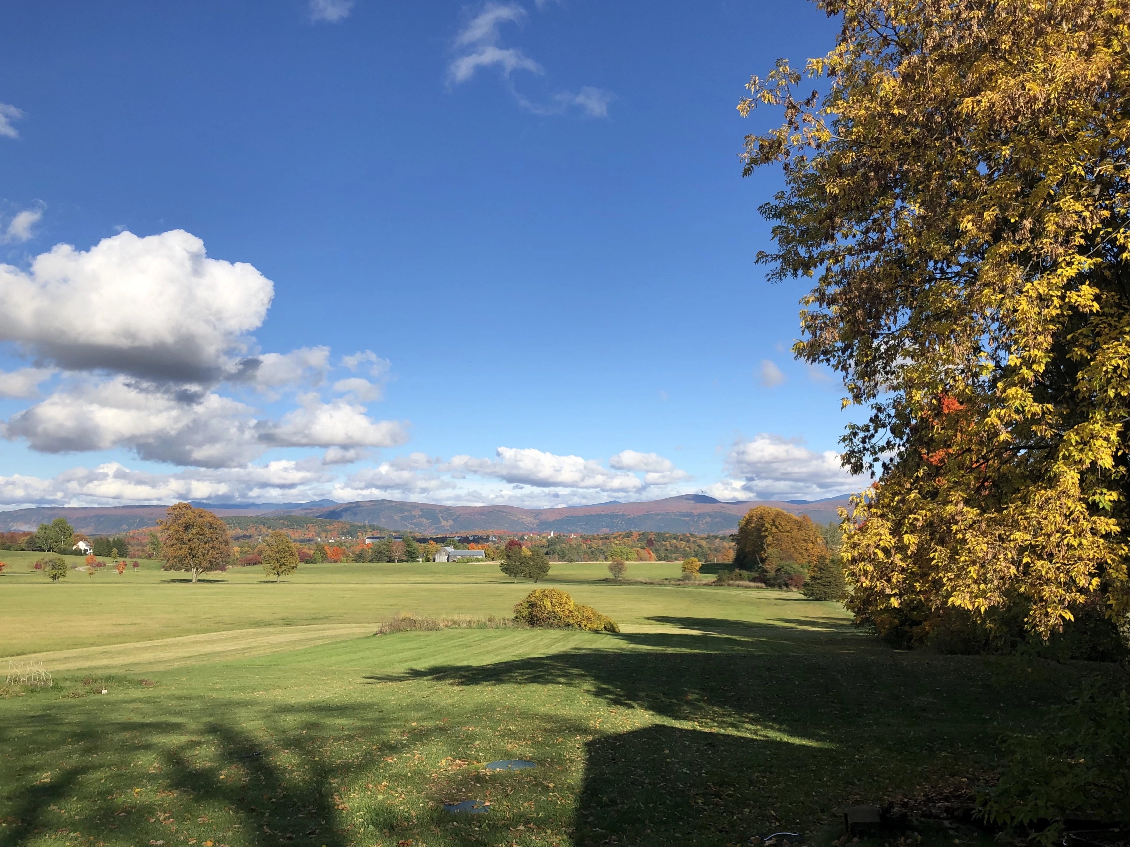
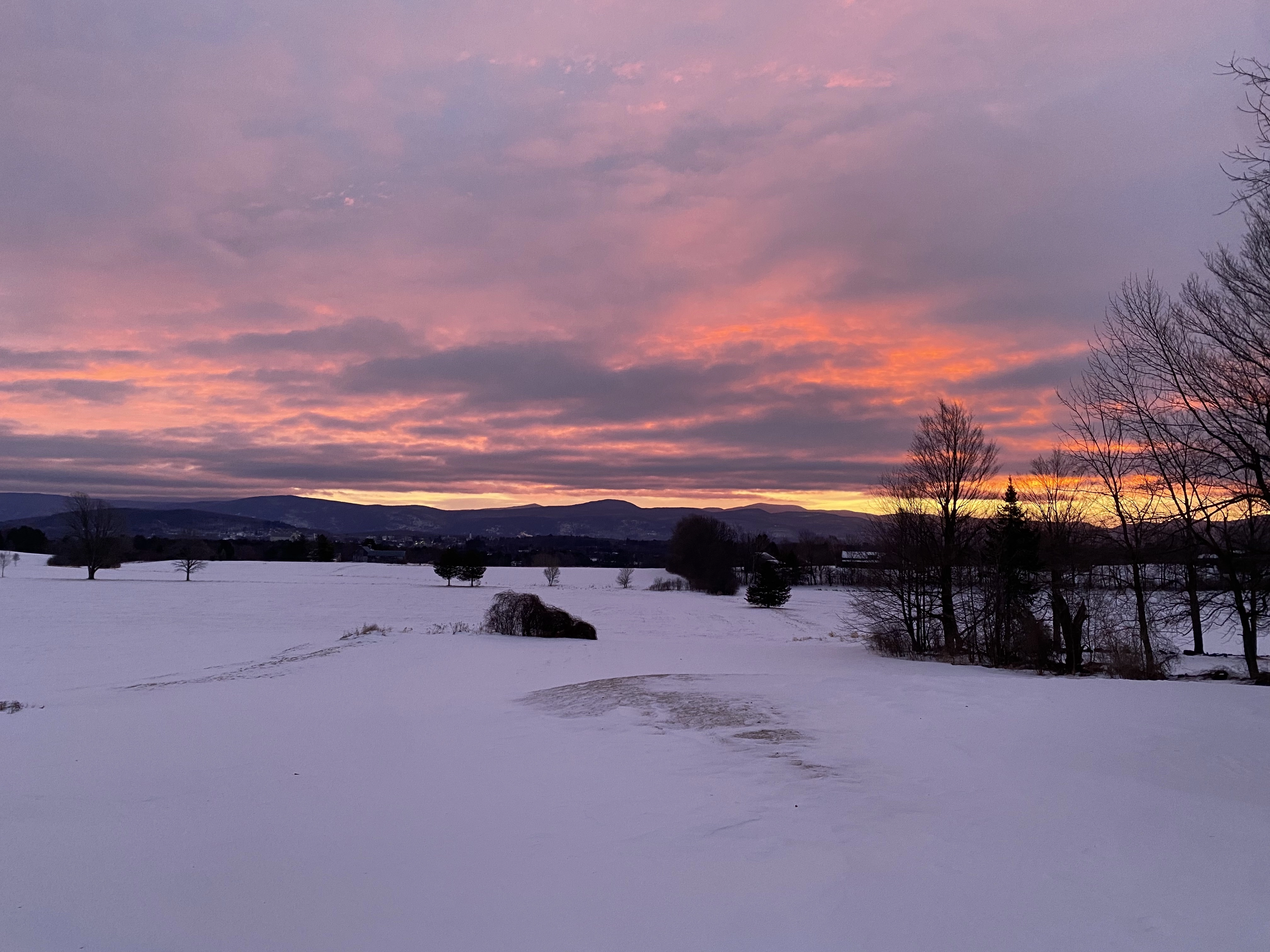
The concept centers on translating the Green Mountains of Vermont into a stylized, modern visual system. Instead of literal landscape imagery, the packaging uses flowing, layered contour shapes—abstracted topographic forms that communicate movement, elevation, and natural rhythm.
The color palette is intentionally bright and saturated, meeting the client’s request for something eye-catching, while the clean white base and minimal typography keep the overall design premium and balanced. The wraparound artwork visually ties all panels together, ensuring the illustration remains seamless whether viewed from the front, sides, or back.
Custom Illustration
- Hand-drawn, abstracted mountain landscape inspired by Vermont’s Green Mountains
- Designed to create a continuous 360° wraparound visual
- High-impact color palette developed collaboratively with the owner
Packaging & Dieline
-
Full production dieline built in Illustrator with perfect artwork alignment across folds
-
Clean layout supporting THC/CBD info, mandatory warnings, and batch labeling
-
Balanced white space and typography ensure premium clarity within regulatory constraints
Client Collaboration
-
Close creative partnership with Flora’s owner to refine color, tone, and overall presence
-
Final packaging reflects both the brand’s identity and Vermont’s natural landscape