ILUMINAR COFFEE: 2×3 Label System
A cohesive packaging micro-system for single-origin and rotating blends.
A modular labeling system designed for clarity, hierarchy, and shelf visibility.
Project Overview

Role
Packaging Design, Typography, Color Systems, Production Prep
Objective
Develop a flexible 2×3 inch label system for a growing coffee roastery that needed:
-
A strong visual identity across origins
-
A typographic system readable at small scale
-
A layout that communicates tasting notes quickly
-
Variants for microlots, blends, and decaf
-
Print-ready files for in-house production
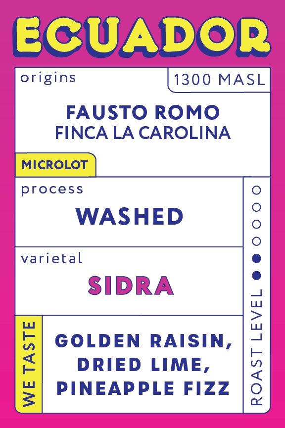
The system is built around a modular vertical grid, allowing consistent placement of origin, process, varietal, elevation, and tasting notes.
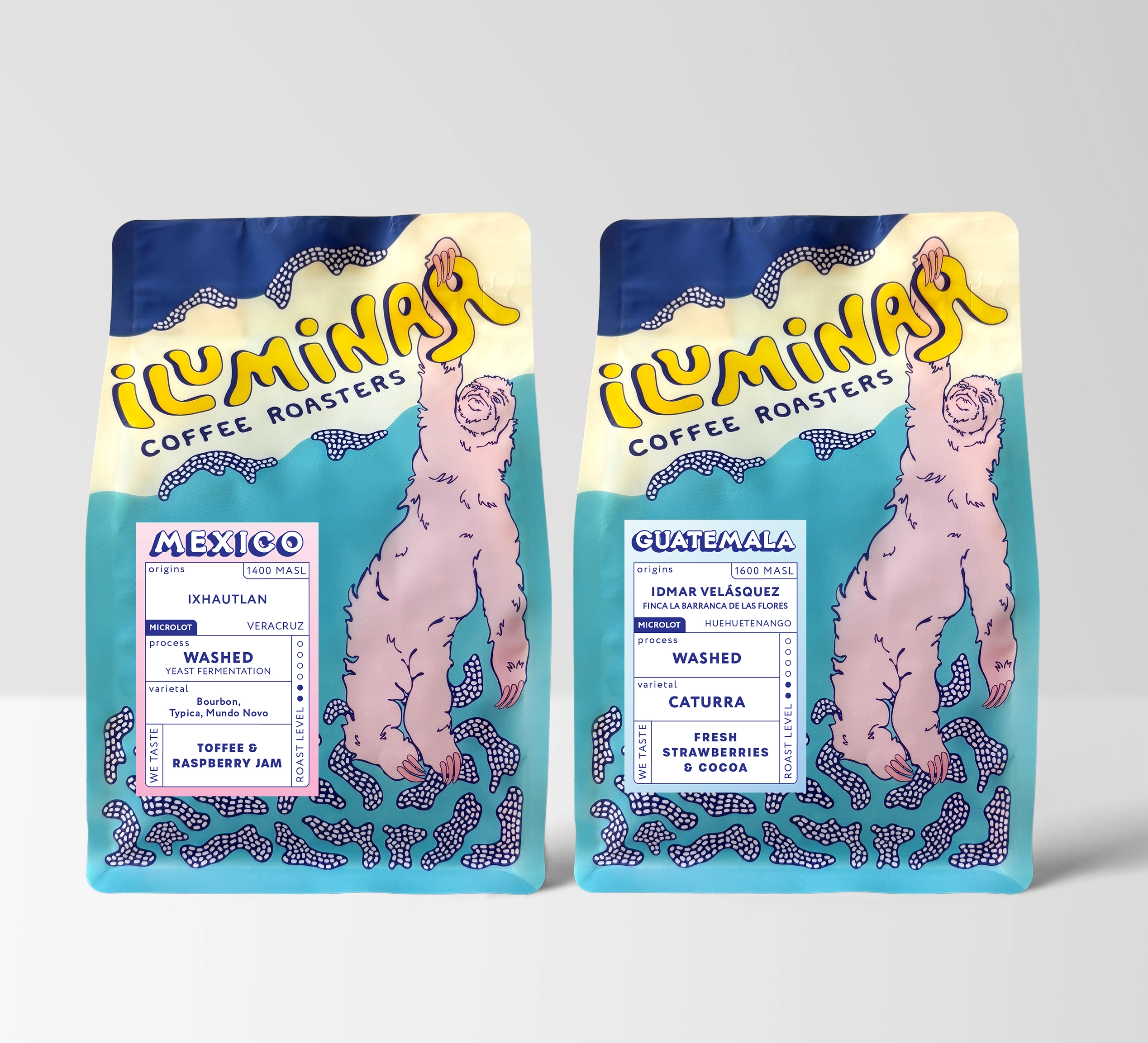
Each origin features a distinctive color field inspired by regional tones, while maintaining a unified type style across the series.
Large condensed type reinforces quick readability, while secondary text follows a clear information hierarchy.

Typography
-
Bold, condensed display type for country names
-
Upright sans serif for metadata
-
Rotated type elements to make the small format feel dynamic
-
Consistent 90°/270° rotations to maximize label real estate
Color System
- Explain the logic:
-
Colors differentiate origins
-
High contrast maintained against deep blue brand type
Grid & Hierarchy
-
3-column modular structure
-
Clear segmentation of origin / process / varietal
-
Roast level indicators at the top as a navigational device
-
“WE TASTE” block anchors the design


