ASSIGNMENT
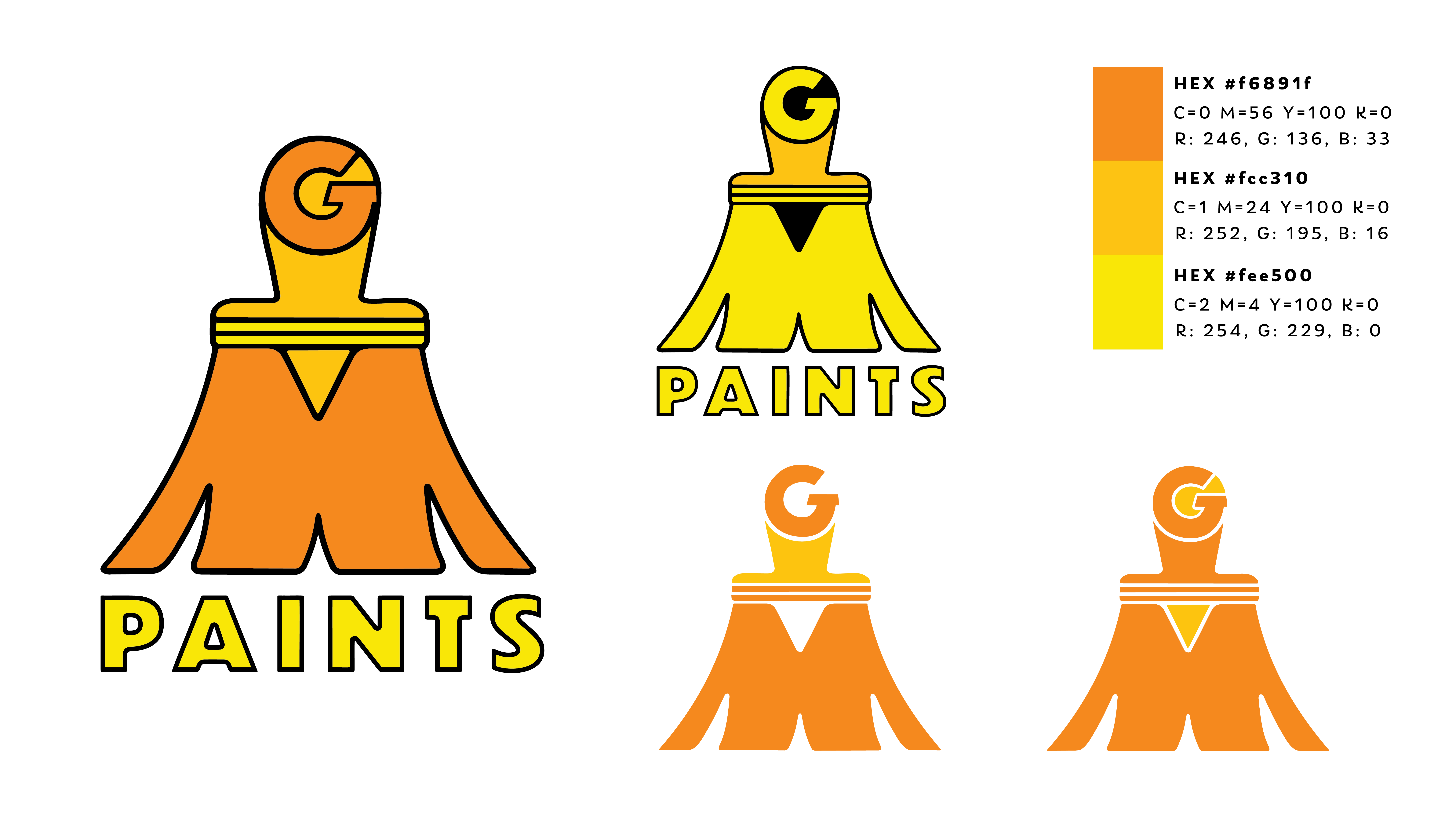
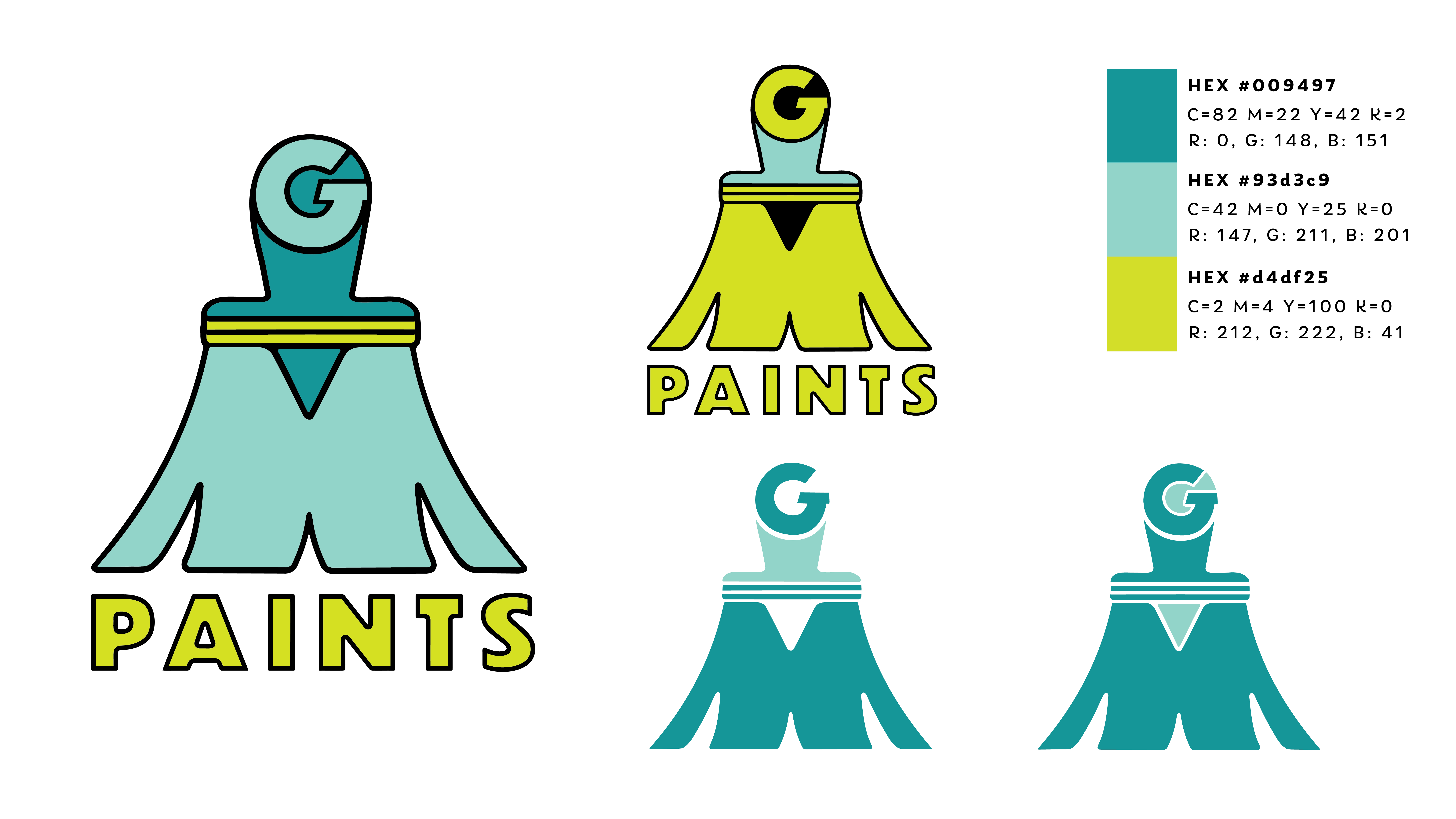
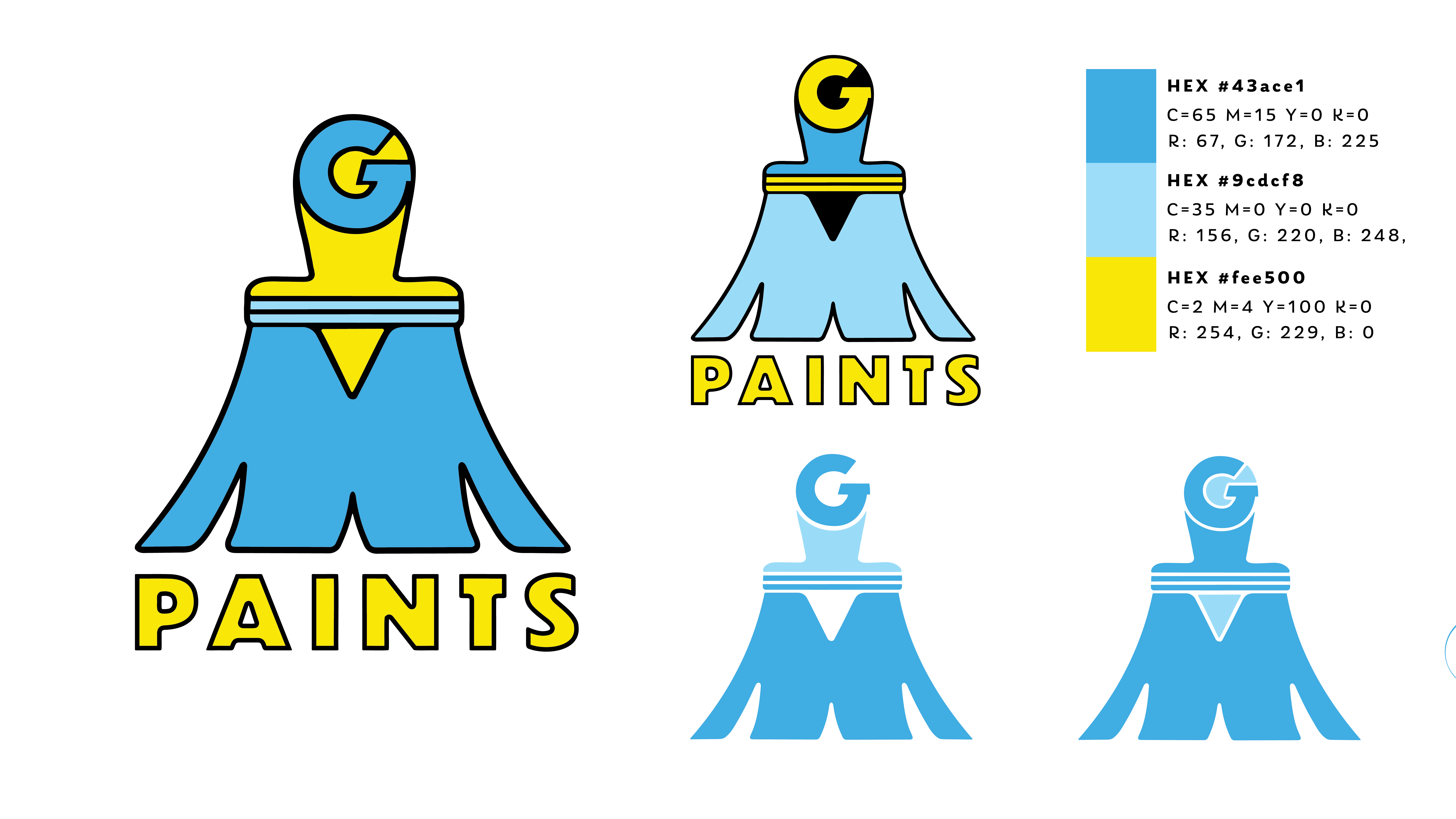
was to develop a logo with variations and 3 color schemes for new paint shop hardware stor opening in Jericho, VT.
THE DOs included bold colors, typographic emblem playing off their initials. THE DON'Ts included generic play on mountains common in this region, color schemes limited to greens
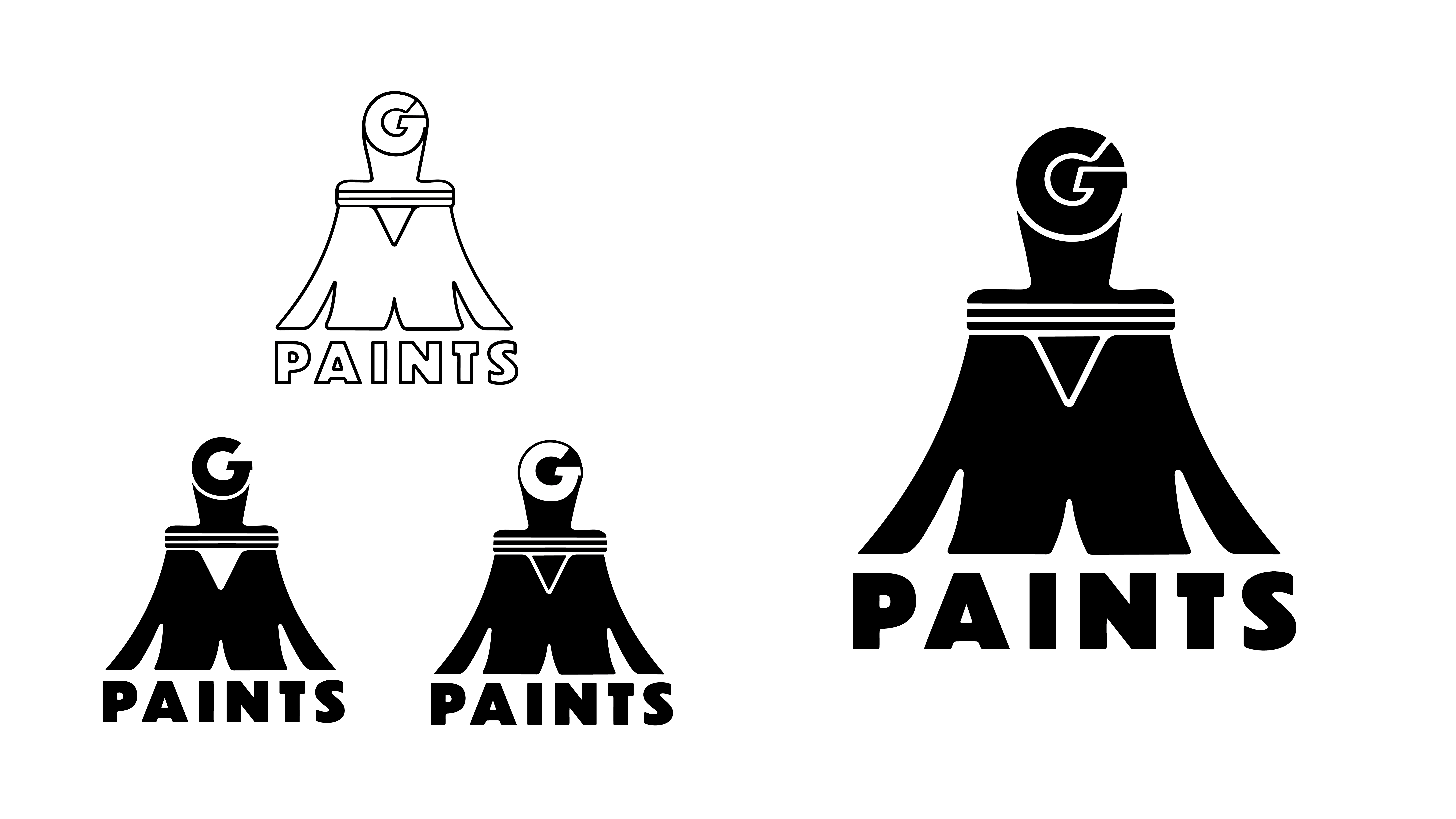
I chose a paint brush, employing the flexibility/movement of the thistles to create the "M" shape. The G was incorperated at the head of the handle. Combined this created a fun and professional look.
The three color variations with 1 main full-lockup logo, an alternative full lock-up, and symbol mark and a secondary single-color mark.
